Quantcast
Channel: InterWorks
Viewing all 2697 articles
Browse latest View live

Alternative Fuel Stations Across the US

$
0
0

Was anyone else fascinated with the American sitcom “The Jetsons” growing up? I know I was. The imaginative, futuristic world was so captivating to me, making me wonder if we would ever have holograms or talking robots. I was most intrigued by the flying cars, how they worked, how they were fueled and if they were practical. Little did I know that as an adult I would be asking myself the same questions about different modes of transportation. Having a background in chemical engineering might answer why I have such a fascination with how things work, in particular, how they are fueled.

An Alternative Future

In today’s world, we are highly dependent on fossil fuels for our means of transportation, but as most of us know, there is a shelf life associated with this. Fossil fuels, as the name implies, are a thing of the past. It won’t be here to power the futuristic cars we saw in “The Jetsons.” Instead, we will need to depend on alternative fuels. The U.S. and many other countries have implemented a variety of alternative fuels that are widely used every day.

I thought it would be interesting to create an alternative fueling station visualization for the U.S. Built with Tableau, this dashboard allows users to access station-specific details, such as location and contact information. The dashboard also provides historical data of when the station was opened and if it is accessible to the public.

Designing Informational Donut Charts

During the design stages of my dashboard, I knew the dataset was composed of seven different alternative fuel types, with informational station data gathered across the U.S. This led me to create interactive and informational donut charts for each fuel type, in order to provide the user with more interactivity for each specific fuel. To do this, I created multiple overlaying pie charts. The back chart displayed the percent of public and private stations, and the front chart was left blank to create the donut itself.

To display the percent of public stations, I had to create two calculations: one that calculated the percent of public stations (SUM(IF [Private or Public Station] = “Public” THEN 1 ELSE 0 END)/COUNT([Private or Public Station])) and another that subtracted that percent from overall total percent (1 – [Percent Public Station]). Next, using those two calculations as Measure Names and Measure Values, I created a new pie chart to display each fuel type and the number of stations available for each.

To make it a donut chart, I then created a “placeholder” calculation of AGG(MAX(1)) on my Rows shelf to create a dual-axis chart. With the second axis as a circle, I was able to add a label of each fuel type in the center of each donut by adding my fuel type name and number of stations to Label on my Marks card.

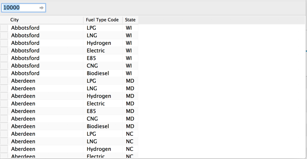
The tricky part was getting each fuel type to stay present on my dashboard when the count of stations was zero since every state didn’t have all seven fuel types available. To address this, I created a new table that had records for each state and fuel type.

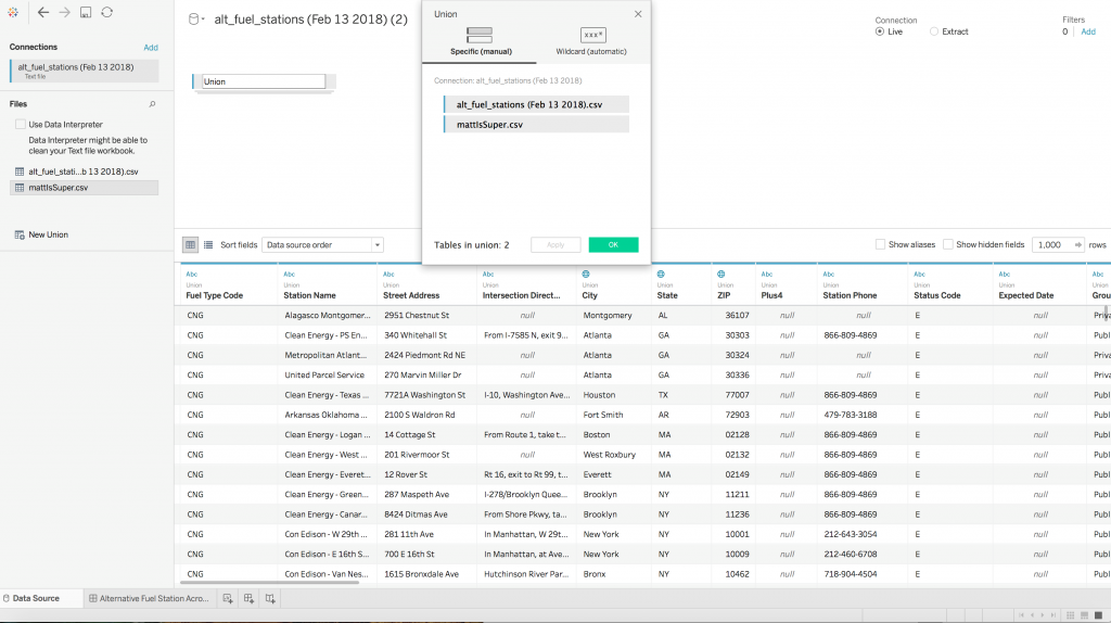
I then created a folder that contained the original data source and the new table, where I was able to union both sheets together, as seen below. This resulted in there being at least one record for the state/fuel type, even if one didn’t exist in the state. With that, my fuel types were able to stay fixed on my dashboard, which eliminated resizing and missing types issues.

Union in Tableau

I hope you will take a moment to look up your hometown and see what alternative fueling stations are available near you. We should all continue thinking of the fuel of the future, so one day we’ll be able to live out our childhood fantasies.

The post Alternative Fuel Stations Across the US appeared first on InterWorks.


Makeover Monday: The NBA’s Soft Salary Cap

$
0
0

The #makeovermonday project, led by Andy Kriebel and Eva Murray, puts out a public data set each week, challenging data vizzers to find a different way to present the data. It’s a great way to practice your visualization skills and force yourself to work with new types of data. They recommend time-boxing yourself and only spending about an hour on it. I never quite make that time limit: I usually come up with my chart types pretty quickly, but then I get to formatting and end up several hours deep on the project. This past week’s project, which involved data about the NBA’s salary cap and historical spending against it, was no exception.

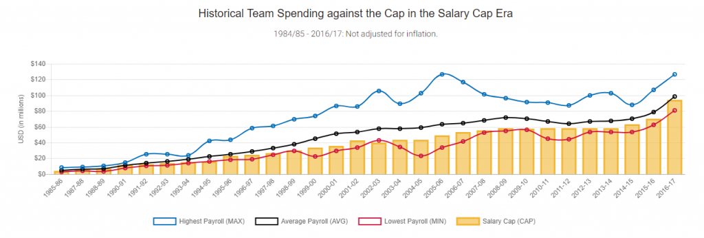
The data was originally presented like this:

Original NBA Cap Viz

When I first looked at the data, I wondered, “What’s the point of a salary cap if the average team salary is consistently trending above it?” And then, “What’s an easy way to normalize the data to account for inflation.” So, I set off to make my own spin-off, focusing on these two things.

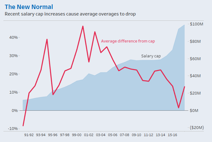
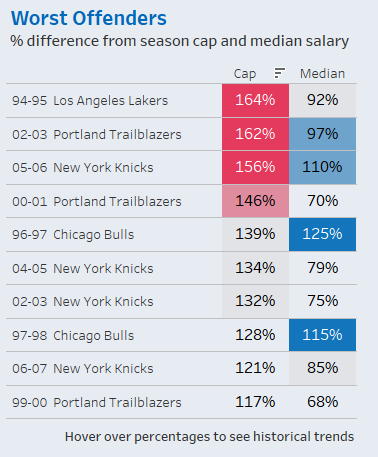
Tackling the harder problem first, I chose to show average team salaries each season as a percent difference from the salary cap. It was kind of a lazy way of accounting for inflation (remember that one-hour limit thing?). Showing a percent difference forces us to look at each season’s comparison to the salary cap that year rather than, say, comparing 1990-91’s average salary to 2016-17’s average salary.

NBA Salary Cap Tableau Viz

After noticing that average spending hasn’t exceeded the cap as much in recent years, I added the salary cap in the background as a dual-axis chart. I thought it was interesting to note the correlation between salary cap increases and changes in the average percent difference. I also added a percent difference from the median team salary in a separate chart to provide a second comparison point that skirted the inflation issue.

NBA Salary Cap Highlight Table in Tableau

After some quick research about NBA salary cap exceptions, I added some context to the top of the dashboard in case anyone else was wondering why so many teams were allowed to spend significantly over the cap. Lastly, I added a box-and-whisker plot at the bottom with a few annotations to call out interesting outliers. And voila! Not even close to my hour limit this time, but here’s what I came up with:

The post Makeover Monday: The NBA’s Soft Salary Cap appeared first on InterWorks.

How to Get the Most from Your Tableau Conference Experience

$
0
0
InterWorks' Booth at Tableau Conference Europe 2018

Two weeks ago, I attended my first Tableau Conference in London. I really enjoyed three fantastic days and decided to write a short blog about it, sharing some tips on how to be well prepared. But first, here’s a fun recap video I put together about InterWorks Europe’s experience:

Plan Ahead, Use the Tableau Conference App

I definitely recommend spending some time to plan the sessions upfront. Don’t waste precious time during the conference. Some presentations (especially hands-on sessions) are very popular and chances are high that some of them will be full. Use the Tableau Conference app, where you can mark your favourite sessions. In case one presentation is fully booked, you can use the app to quickly check other available alternatives and go there. The application can also send you reminders about your favourite sessions as well as provide the most up-to-date information.

Watch the Recorded Sessions

In case you are like me and spent too much time talking to people at the booth, or you missed one of the sessions, or you were interested in several of them that ran in parallel, you can watch the recorded sessions. All the presentations are recorded and you can even prolong your conference experience. You can find them here. Enjoy!

Meet the People

One of the best parts of the conference was meeting the people from the community. Many of them I only knew online and it was a great pleasure to meet them in person. At first, I was a little bit sad that I had to spend a certain amount of time at our booth, thinking that I would miss some interesting sessions, but it turned out to be the opposite. I really enjoyed talking to other Tableau users, listening to their stories and challenges.

The most rewarding part was when there was a perfect match between users’ needs and our Power Tools for Tableau or Portals for Tableau, which can bring Tableau experience to another level. There are many community events and meetups happening during the conference. Using the Tableau Conference app, you won’t miss a thing. Start your day with a morning run or yoga, attend Makeover Monday in the afternoon and continue with user groups or industry-related meetups in the evening.

Experience It

For me, it is hard to say what was the highlight of the conference. As mentioned in our pre-conference podcast episodes Part 1 & Part 2, keynotes are always great and you don’t want to miss them. The “special guest keynote” this time was Chess Grandmaster Garry Kasparov. He had a very interesting presentation about artificial intelligence and his own experience when playing against Deep Blue.

Francois Ajenstat and Devs on Stage showed new features of Tableau and what’s coming. It was amazing to attend the famous Iron Viz competition live, which reminded me of an Oscar ceremony, and to party with colleagues and data friends during Data Night Out.

Thank you, Tableau, for building such a great data community and for bringing us all together. I can’t wait for the biggest Tableau event in New Orleans later this year and next year in Berlin! See you there!

The post How to Get the Most from Your Tableau Conference Experience appeared first on InterWorks.

Advance with Assist: Context Filters and LOD Calculations

$
0
0

“My LOD calculation results are not matching up during QA, and I can’t figure out what’s different. Can we hop on a screenshare to discuss?”

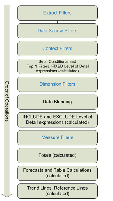
We hopped on a screenshare with the client. Upon reviewing the two views with her, everything appeared to be in order at first glance. However, since the reports were built by another employee and this client had inherited the workbook, we dove in a little deeper to find an LOD calculation. This calculation was using a FIXED level. Her dimension filters were not applying correctly, as when you look at the Order of Operations that Tableau uses, in order for a dimension filter to affect the FIXED calculation, they must be added to Context first.

Tableau Order of Operations

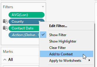
Adding a filter to Context isn’t a complicated thing to do. It’s a right-click on the dimension filter you want to apply it to. If you are using LOD calculations, this is something that could be overlooked if all you are looking at are the pills between views to see what the differences are.

Add to Context

Wouldn’t it be nice to have a symbol on the pill indicating an LOD in play? 😊 Maybe something for the idea center there. I know I’d like to know when one was being used without looking at the calculation itself.

The post Advance with Assist: Context Filters and LOD Calculations appeared first on InterWorks.

A Solution to Tableau Line Charts with Missing Data Points

$
0
0
Continuous Line

A question that seems to come up every so often as a consultant is around how Tableau doesn’t show data where there is no data. Sounds kinda obvious, doesn’t it? But let’s frame this slightly differently and we can see that whilst this does make sense, it can be a bit of an annoyance.

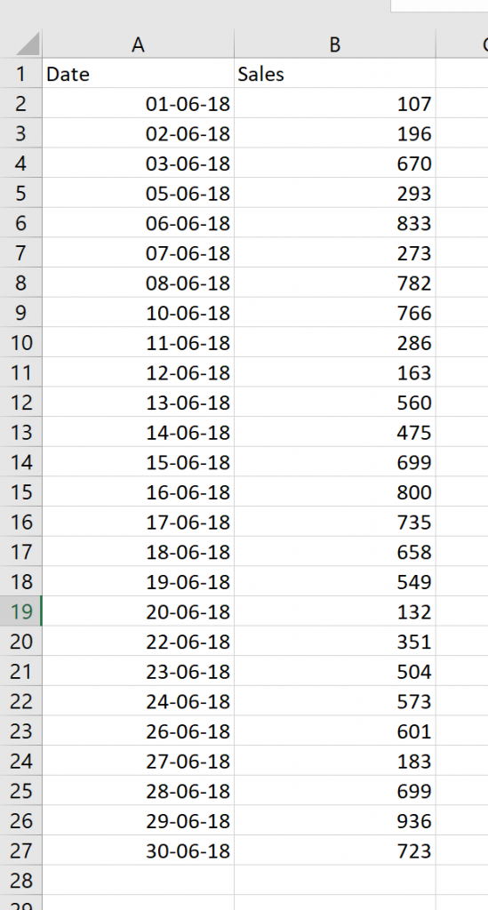
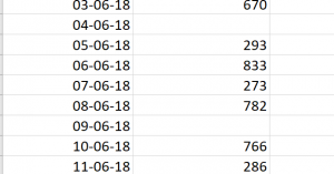
Let’s take a look at a simple data set showing sales in June 2018:

Simple Sales Dataset

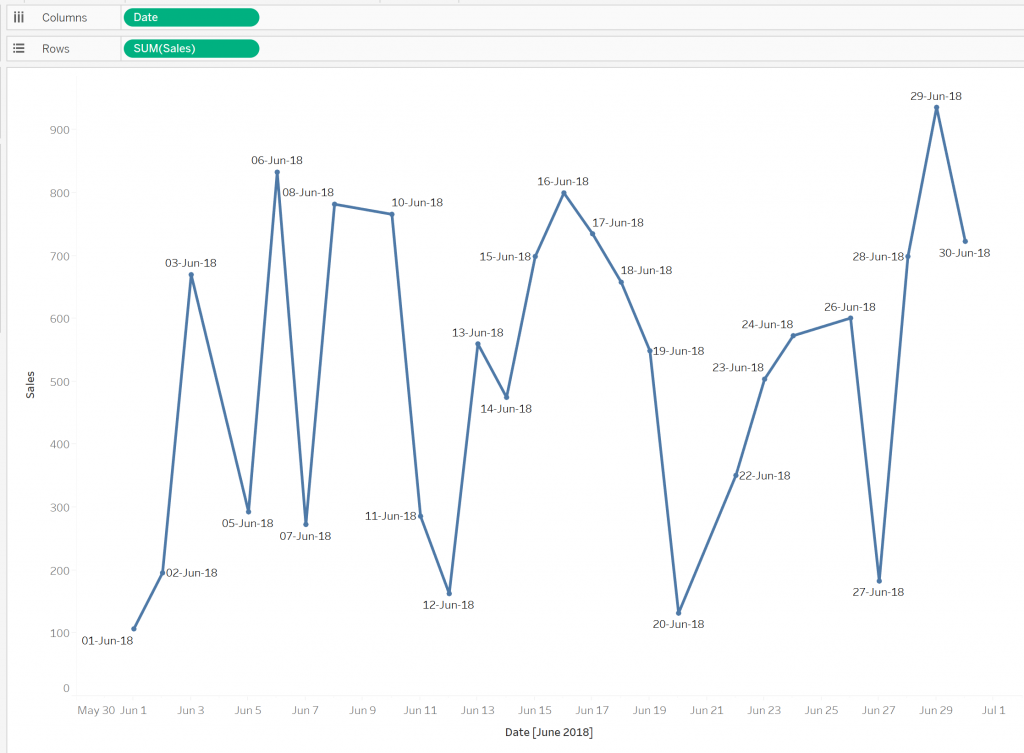
Two things to notice. Firstly, I’m English and live in Australia. Sorry to our U.S. friends, but I can’t bring myself to use your date format without dying inside a little. Secondly, not all dates are populated. We don’t have data against June 9, June 4 and a couple of other dates. So, if we plot this as a line chart in tableau we get:

Line Chart in Tableau

I have added Date to the label for clarity of what is going on. We can see that we have no data points at all for the missing days. This makes sense. Tableau isn’t inventing data, and having no data point is different than having a null value. But if we were a small retail outlet, for example, this lack of data is more than likely a day where there could have been sales but there happened to be none. In this case, it probably makes sense to consider these days as having 0 sales and the line chart should represent this. Looking at the chart above, unless we pay close attention, we don’t see that there were zero sales on June 9.

So, if we do want to see these dates without data as a date with zero sales, how do we do this?  Of course, we can use some ETL to update the source data. But if that’s not an option and this is a one-off piece of analysis, it’s likely over the top to write some ETL. So, can we make this work in Tableau? Yes! The obvious answer is to use the IFNULL function, and this would work great if our data looked like this:

Missing Data

But it doesn’t, so the IFNULL function won’t work as there are no nulls in the data. As mentioned above, we don’t have null values, we have no data. This is a critical and often misunderstood point.

The Solution

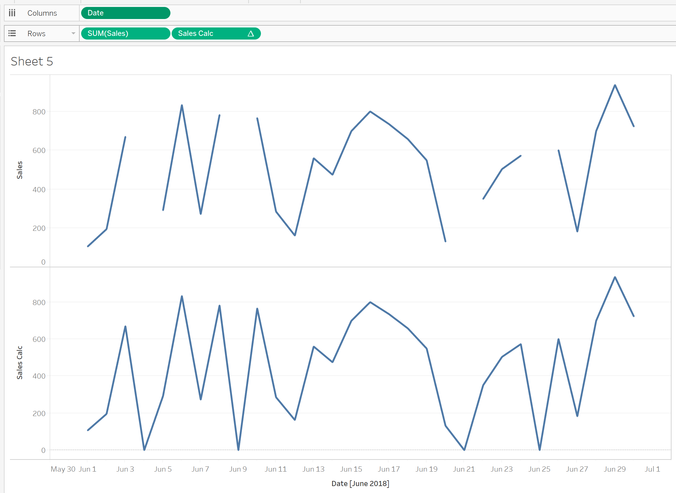
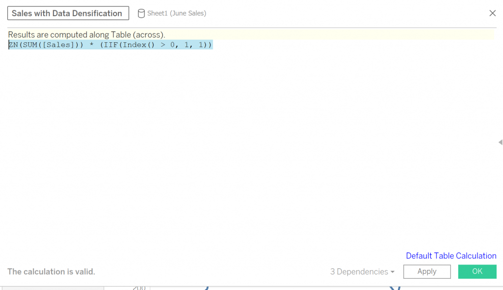
The trick is to use a table calculation, but of course, we don’t want to change any data values. So, we build a table calculation that pretty much does nothing other than saying to Tableau, “Hey, I’m a table calculation.” The reason for this is that this turns on data densification (where Tableau will essentially “fill in the gaps” in a date/time series). I have built a calculated field:

Tableau Calculation

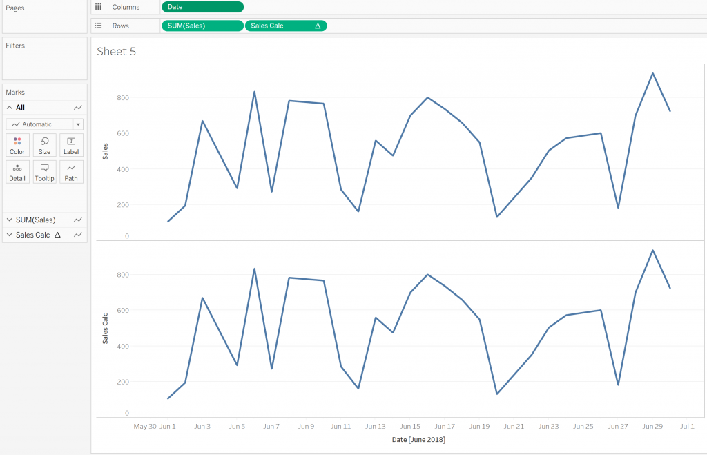
The IIF expression will always return 1, so the result of this expression is the same as ZN(SUM([Sales])). Now if we add our original Sales field and the new calculated field to our worksheet we see the same thing:

Add Sales and Calc

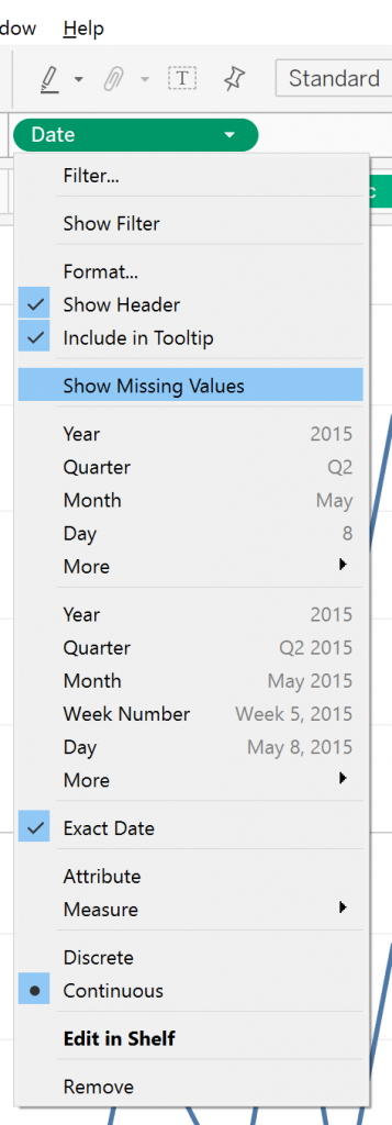
So, what … it doesn’t work? Sorry, it does – stay with me. There’s just one more step. We need to click on the Date pill and select Show Missing Values:

Show Missing Values

With our new calculated field, we see a nice continuous line as opposed to the stop/start view of the original field:

Continuous Line

So, there we have it – a nice, quick and easy way to fill your data out and get a fuller picture of line charts. Of course, this should be used with caution. Sometimes having no data displayed is the right option. For example, if we were a retail outlet that was only open on weekdays we wouldn’t want our chart dropping to zero every weekend.

The post A Solution to Tableau Line Charts with Missing Data Points appeared first on InterWorks.

Using Alteryx to Create the (Almost) Ideal Dataset for an Ottawa Data Viz

$
0
0

Ottawa: Capital city to our neighbor to the north, Canada. Home to astronauts, comedians, musicians and more. The University of Ottawa educated the greatest game show host of all time, Alex Trebek, who studied philosophy (presumably because he couldn’t major in trivia). But most exciting of all, Ottawa is home to an excellent open data catalogue. Full of information on contracts, budgets, population elections, you name it. Alright, it’s maybe not the most exciting thing about Ottawa, but it’s definitely exciting to a data dweeb like me.

After browsing the Ottawa Data Catalogue, I found some awesome datasets on sports fields, skateparks, beaches and other recreational facilities. I thought, “What if I l used a list of all their recreational facilities and made a viz out of that!” So, I started looking for the compiled list of all their recreational facilities. Then I hit the bottom of the catalogue. No big, clean, fun list of Ottawa’s play structures, skating rinks and tennis courts. Just 14 different sets for 14 different types of parks.

Fortunately, I had both the tools and the knowledge to blend these data sets and visualize the results. You can keep reading to learn about the process or you can jump directly to the viz.

Enter Alteryx

Thanks to Alteryx, I was able to take these 14 different data sets, with varying amounts of detail and information, to make one, clean, analyzable dataset. Here’s how:

Step 1: Load all 14 .shp files.

Step 2: Create a PARKTYPE Field. This adds another field naming the type of park it was based on the file it came from. This helped me distinguish the basketball court from the sledding hill from the skating rinks and so on.

Step 3: Rename the main descriptor for each field. Instead of having different fields for COURT_TYPE,” “FIELD_TYPE or RINK_TYPE, I decided to create one common column called FACILITY_TYPE.

Step 4: Rename the name field. This was to remediate the issue caused by different naming conventions from the different files. Ball-Diamonds used FIELDNAME while Splash Pads were labeled by PARKNAME, and others just used NAME. All to describe the same thing. So, I created a unique NAMEID field, so that when creating the union between these tables, they would stack into one consistent field.

Step 5: Select the only necessary fields. There were multiple fields that only applied to one specific file and wouldn’t be useful for a final set, such as LINK_DESCRIPTION, CLASS or POST_TYPE. Canada is also cool and bilingual, so it had a French copy of every field. Sadly, I don’t speak French, so I nixed these.

Step 6: Union. Union. Union. And, you guessed it, Union. 14 total unions were needed to combine the data into one, long table. Luckily, you don’t need a union action for each instance and can combine them all using a single union node. Just drag and drop.

Step 7: Add a Unique Identifier. While PARKID and FACILITYID were present for most fields, they often overlapped. Parks had multiple facilities, and the FACILITYID was not unique across parks. To guarantee that there was a unique identifier for each row of the data, I used the Row ID Tool. I called my new field: UNIQUE_ID. Clever, I know.

Step 8: (Optional) One last select statement. This is to make sure no unwanted fields slipped through the cracks, and I only had the data I wanted.

Step 9: Output data as a .shp file. I chose the .shp to keep the spatial object that would allow it to work in a Tableau map.

Step 10: Lean back, crack my fingers and hit Run.

But GHASP!

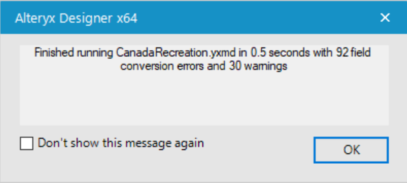
Alteryx Designer Error Message

That’s a lot of warnings! But worry not, there is a simple explanation. The field conversions errors occurred due to the Created_D and Modified_D fields. These were blank date fields that were recorded as “ – – “ which is not a valid date, so we received an error notice. These fields were also not included in the final dataset, so no harm, no foul!

The warnings were not the doom of the project either. They simply let me know that there were some missing values in certain fields (i.e., some of the values for the links field were missing, perhaps because there is no website for Ottawa Lawn bowling … yet). Unfortunately, Alteryx does not allow you to make data appear where none exists.

And “voila!” Now with a ready data set, I began to explore the various activities for a day out (or a day “oot”) in lovely Ottawa. Take a look!

Show a little love to our neighbors to the north (and in case the whole North Korea thing doesn’t pan out). Take a look into some cities. Ottawa ranked one of the best place to live in Canada, as documented here and here.

Appendix

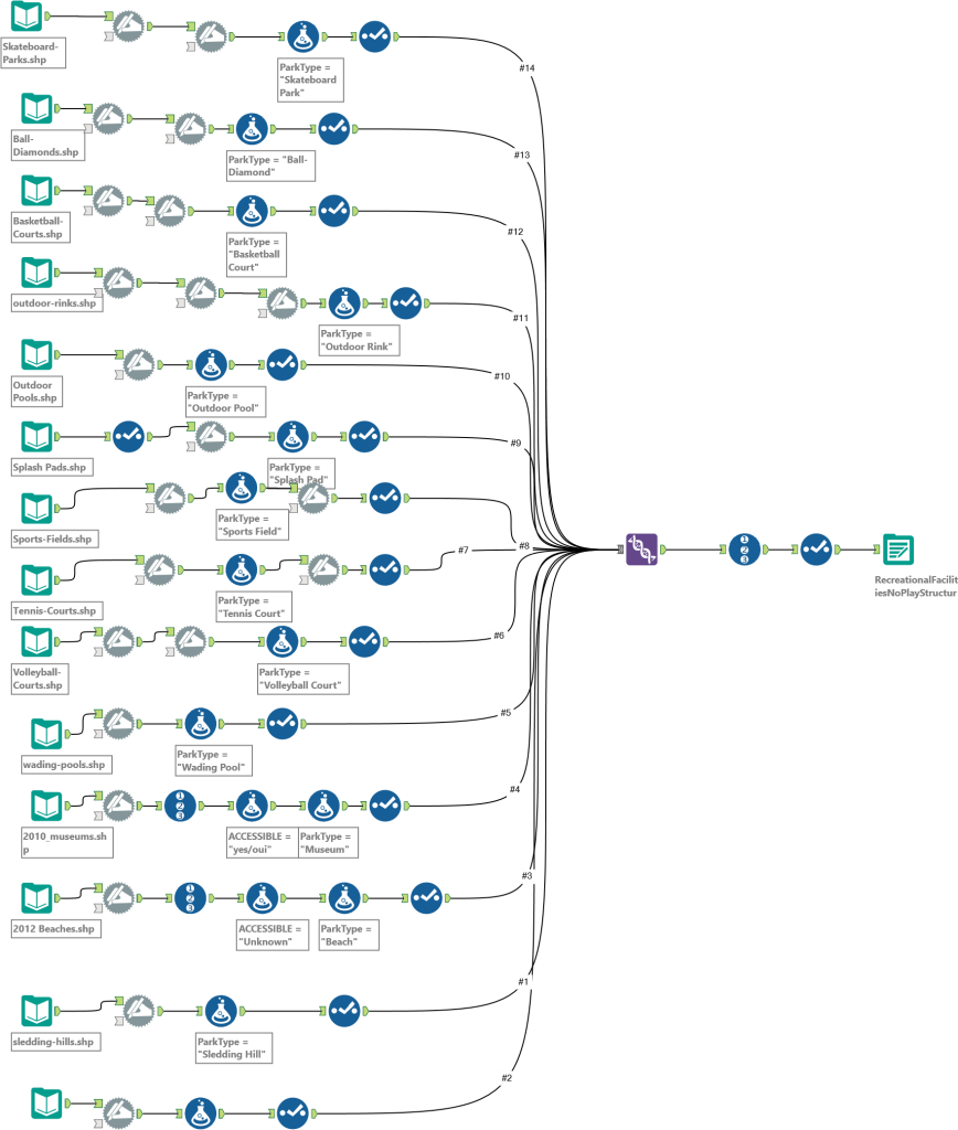
Screenshot of Alteryx workflow:

Alteryx Workflow for Ottawa Dataset

The post Using Alteryx to Create the (Almost) Ideal Dataset for an Ottawa Data Viz appeared first on InterWorks.

Three Years at Michigan: Harbaugh’s Tenure

$
0
0
Michigan Football Data Viz

I grew up watching college football and always remembered that iconic maize and blue. Now as an adult, Michigan football is somewhat of a family tradition. I watch their games every Saturday during the year with my friends and family, occasionally making the trip up to Ann Arbor to watch them play in one of the most recognizable stadiums in all of sport: Michigan Stadium.

Naturally, as an Analytics Consultant, I thought of how I could tell a story about Michigan football with Tableau. Using Wikipedia as my data source, I was able to put together some data points to tell this story. Check out the full Tableau viz below:

The Story: Harbaugh’s Tenure This Far

I took a look at the past three seasons. These years have been tumultuous, to say the least. The transition from Brady Hoke to Jim Harbaugh was looked at by all at Michigan as the savior of the program. A lot of alumni have said a Michigan man was needed to turn the program around.

In his first season, he exceeded expectations, winning 10 games including a bowl game blowout of Florida. Everything was looking up with the second season being more of the same, but the big miss for his tenure has been against the two biggest rivals in the Big Ten: Michigan State and Ohio State. This past year was a test, with th most losses in a season for Harbaugh and more frustration with his lack of success against those rivals and a lackluster season record.

Three years is generally the amount of time that most new coaches are evaluated.

Quantifying Success

In evaluating Harbaugh’s performance, I looked into different factors such as his record in rivalry games by the opponent (i.e., Minnesota, Michigan State, Ohio State), ranks for major statistically categories (yards, points, etc.) amongst the NCAA, and performance in different temperature ranges.

Rivalry games are generally used to measure a coach’s performance. Especially in the cases of Michigan State and Ohio State, there are conference and playoff implications. Winning these games is extremely important in order to keep your job. Harbaugh has not done well in these games in his first three years.

Performance on the offensive and defensive side of the ball are extremely important. Points per game and yards per game are important to how many wins that a team might have. Comparing offensive production and defensive strength to the other teams in college football shows how well a team is performing overall. Tracking this progress over the years can show how where a coach has strengths and where changes are necessary.

One unique take on this three-year span I gathered was how the team performed in different temperature ranges. In the Big Ten, conference teams have the unique opportunity to play in a variety of temperature ranges, which is not the case in all conferences. In part of the dashboard, I tracked performance in different temperature ranges to see if game temperature played a part in how Michigan performed.

Putting all of these factors together, we can measure how Jim Harbaugh has done in his first three years. Personally, I’m hoping to see this team improve, and these factors are where we need to see improvement.

Go Blue!

The post Three Years at Michigan: Harbaugh’s Tenure appeared first on InterWorks.

How to Fully Remove Microsoft Azure AD Connect

$
0
0

Microsoft Azure AD Connect

Microsoft’s Azure AD Connect is a great tool that allows admins to sync Active Directory credentials from local domain environments with Microsoft’s cloud (Azure/Office 365), eliminating the need for users to maintain separate passwords for each.

While not a common occurrence, there may be reasons that you would need to remove Microsoft’s Azure AD Connect utility from your environment. This can be achieved in a few short steps and involves both removal from the local domain environment as well as deactivating the service in the cloud.

Step 1

Open PowerShell (Run as Administrator).

Step 2

Install Microsoft Online module for Azure Active directory using the following command:

Install-Module -Name MSonline

If prompted to continue, input “Y” and press enter. Any subsequent confirmations can be accepted by inputting “A” for “Yes to All” and pressing Enter.

Step 3

Input login credentials using the following PowerShell command:

$msolcred = get-credential

You will be prompted to authenticate. Use the global administrator account within your Office 365 tenant (ex. user@yourdomain.com) and the corresponding password.

Step 4

Initiate Connection to Office 365 using the following PowerShell command:

connect-msolservice -credential $msolcred

Step 5

Keep this PowerShell instance open, we will use it in later steps.

Step 6

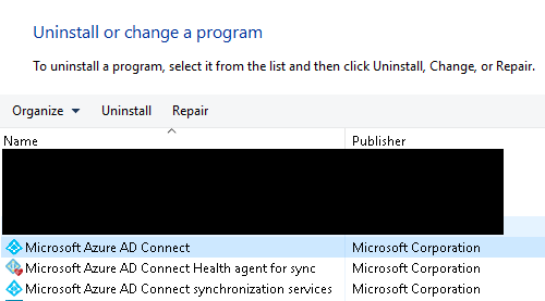
Uninstall Azure AD Connect application (and services) from your local domain environment using Control Panel.Uninstall Microsoft Azure AD Connect

Step 7

Once you have AD Connect uninstalled, you will still need to disable the service through office 365. To do so, use the following PowerShell command.

Set-MsolDirSyncEnabled -EnableDirSync $false

You will be prompted to confirm, press Y to confirm and then press Enter.

Confirm?

Step 8

To verify that directory sync was fully disabled, use the following PowerShell command:

(Get-MSOLCompanyInformation).DirectorySynchronizationEnabled

A returned value of False will validate the deactivation.

Need to Reenable AD Connect?

If you ever need to reenable AD Connect, repeat the PowerShell procedures above and use the following command in place of step 7:

Set-MsolDirSyncEnabled -EnableDirSync $true

Please note depending on the size of your AD environment, you may have to wait several hours before Microsoft will allow you to reactivate. You can then reinstall and configure Azure AD Connect in your environment.

The post How to Fully Remove Microsoft Azure AD Connect appeared first on InterWorks.


The Basics of Loading Data into Snowflake

$
0
0

For the second post in my continuing series on Snowflake, I wanted to expand on some concepts covered in my JSON post. Last month, I walked you through how to work with JSON in Snowflake and discussed the process Snowflake uses to flatten JSON arrays into a format that can be easily queried. For this post, I want to talk about what happens before we can access the power of Snowflake with ANY data. This week we’re going to talk about loading data into Snowflake, which due to its cloud nature, requires a different process than standard or legacy database systems.

Snowflake supports a handful of file formats, ranging from structured to semi-structured. Layered on top of the file formats are the protocols we can use to bring that data into Snowflake. Since Snowflake has a multi-cloud architecture (Amazon Web Services, Microsoft Azure and a goal of Google Cloud support in the future), we luckily have a few options to get our tables loaded. I’m going to spend a bulk of the time today talking about how to perform a simple AWS S3 load.

AWS

Loading from an AWS S3 bucket is currently the most common way to bring data into Snowflake. The entire database platform was built from the ground up on top of AWS products (EC2 for compute and S3 for storage), so it makes sense that an S3 load seems to be the most popular approach. Loading data into Snowflake from AWS requires a few steps:

1. Build and Fill an S3 Bucket

To begin this process, you need to first create an S3 bucket (if you’re unfamiliar with this process, look here). Something I really like about the way Snowflake interacts with these S3 buckets is that the bucket can contain any of the supported file formats and Snowflake will allow you to specify what to pull out. Snowflake allows you to specify a file format with the copy command, meaning that whether my project utilizes JSON, CSV, Parquet or a mixture of all three, I can organize my data into a single S3 bucket for each project I am working on.

2. Build Snowflake Table and Load from S3

Now that we’ve built and filled our bucket with data, we want to bring it into Snowflake. We can go ahead and build the tables we want that data to reside in. Since Snowflake uses standard SQL language, and this is simple enough. One thing that is important to note about the table creation is that if you have semi-structured data, it does not require a dedicated table. You can load structured and semi-structured data into the same table.

For my example, I grabbed some JSON that contains Countries and their Country Codes. I also grabbed a CSV containing some detailed information about these countries. After uploading each of these to my S3 bucket, I can begin pulling them into Snowflake to populate this table:

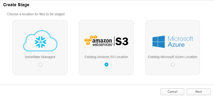
3. Build a Stage

In the database segment of the UI, I have a section for Stages. This is where I can build a stage using the UI. As you can see above this is pretty straightforward, I selected S3 because that is where my data currently resides. After selecting S3, I am taken to a menu to give Snowflake the information they need to communicate with my S3 Bucket. The main point of confusion on this menu is the URL textbox. All that you need to insert here is the name of your S3 bucket. Snowflake will use your AWS Key ID and Secret Key to locate the correct AWS account and pull the data. The URL should look something like this:

S3://[YOUR BUCKET NAME]/[DIRECTORY IF NEEDED]

You can also select at the bottom left-hand of the menu to Show SQL. This is a good way to get an understanding of how to interact with Snowflake’s tools programmatically. I tend to prefer building stages in the worksheet, the code looks like this:

CREATE STAGE "HCALDER"."TESTINGSCHEMA".LoadingBlog URL = 's3://iw-holt'

CREDENTIALS = (AWS_KEY_ID = 'PostingYourKeyontheInternetisBad'

    AWS_SECRET_KEY = '******************');

4. Copy Data to Your Table

Now that I have a stage built in Snowflake pulling this data into my tables is extremely simple. I built a table that contains 6 columns, one for my JSON data, and 5 for the other information contained in my CSV file. To copy from my stage all that was needed is this snippet of code:

COPY INTO [TABLENAME] ([COLUMN]) FROM @[STAGENAME]

FILE_FORMAT=(TYPE= 'JSON' STRIP_OUTER_ARRAY= true)

PATTERN= '.*.json';

               COPY INTO [TABLENAME] ([COLUMNS]) FROM @[STAGENAME]

FILE_FORMAT=(TYPE= 'CSV')

PATTERN= '.*.csv';

One thing that I want to call out here is that I ran two separate commands to populate my table. I ran the first statement above to load my JSON data into the variant column and then modified it to pull out my CSV data for the second go round. Please check out this page from the Snowflake docs that gives all the details you’ll need on the different file_format options. Some can be tricky. It also gives you all the information you would need to save the file format for future use.

Also, notice how I used Regular Expressions on the final line to pull out all JSON and CSV files from my bucket, you can also use this method with other RegEx patterns and is a good way to pick up the pace on your data loading.

The benefits of loading from S3 are substantial; the amount of storage available is virtually infinite and the dependency is incredible due to data replication across Amazon’s regions. Now that you know how to pull data into Snowflake, I’m going to ease your mind about working with different kinds of files. Loading different file formats is easier than you think.

File Types

I’m going to quickly walk you guys through some tips on how to take advantage of the tools Snowflake gives us to load different types of data files and discuss a little bit about what you should be aware of when loading different file types.

CSV (Any Delimited File)

Working with CSV data is simple enough. When building the table, be sure to have proper data types predefined and ensure that your file is clean enough to pull in. Snowflake gives you quite a few options to customize the CSV file format. Here is the doc outlining each and every Snowflake option for the CSV file format. Don’t worry, I won’t make you go read that – the most common changes will be your FIELD_DELIMITER and SKIP_HEADER options. Here is a sample copy statement you can use for your own data loading:

COPY INTO [TABLENAME] ([COLUMN]) FROM @[STAGENAME]

FILE_FORMAT=(TYPE = 'CSV' FIELD_DELIMITER = ’|’ SKIP_HEADER = 1)

PATTERN= '.*.csv';

JSON

JSON has been our first adventure into semi-structured data. I’m not going to go too in depth on this, but if you would like more information check out my blog post all about JSON in Snowflake. Similar to CSVs, there is a multitude of things you can specify in the copy statement. I recommend using the STRIP_OUTER_ARRAY option for most JSON files due to the standard collection process, but it is not always necessary. Here’s another copy statement for JSON data:

COPY INTO [TABLENAME] ([COLUMN]) FROM @[STAGENAME]

FILE_FORMAT=(TYPE = 'JSON’ STRIP_OUTER_ARRAY = TRUE)

PATTERN= '.*.json’;

XML

Full disclosure: XML in Snowflake is weird. It can be annoying and is really the only piece of the entire database that is a little quirky to work with it. Loading is the same as other semi-structured data; it’s querying against it that gets a little bit tricky. Since the purpose of this post is to talk about loading, I’ll save you guys from a five-page tangent on how to query XML (coming soon?). One thing to note is that Snowflake does have quite a few options available for working with XML data. As far as I am aware, the default XML file format has been sufficient for everything I’ve tested. Here’s an example copy statement to bring XML data into Snowflake:

COPY INTO [TABLENAME] ([COLUMN]) FROM @[STAGENAME]

FILE_FORMAT=(TYPE = ‘XML’)

PATTERN= '.*.xml’;

Avro

Now that we’ve played with JSON and XML data, I can show you how easy it is to load and work with Avro and essentially every other semi-structured data format that Snowflake supports. The thing to keep in mind with any semi-structured data is that you must load this data format into a table containing a VARIANT column. After building a table that fits my requirements, all I do to load my table with Avro data is this:

COPY INTO [TABLENAME] ([COLUMN]) FROM @[STAGENAME]

FILE_FORMAT=(TYPE = ‘AVRO’)

PATTERN= '.*.avro’;

Avro differs from JSON and CSV because it only supports one additional file format option, which is COMPRESSION. After pulling in our Avro file, we can query against it the same way we worked with JSON data last week.

SELECT

[VariantDataColumnName]:[AvroKey]::[DataType] [NewColumnName]

FROM [TableName];

ORC

If you can’t tell, I’m starting to get excited. I could literally copy and paste the above paragraph to describe working with ORC data in Snowflake. Variant table … query with SQL … rewire your brain to actually enjoy working with semi-structured data … and “boom” we’re done. To query ORC data, you can copy the statement for Avro. One thing that is important to keep in mind is that ORC does not have any supported file format options, so your copy statement should always look like these first two lines. Here’s another fancy copy statement:

COPY INTO [TABLENAME] ([COLUMN]) FROM @[STAGENAME]

FILE_FORMAT=(TYPE = ‘ORC’)

PATTERN= '.*.orc’;

Parquet

I wish I had more to tell you guys, I really do. Parquet is going to be the exact same procedure. Snowflake has really done an incredible job creating a static experience with MOST semi-structured data (XML, I hate you). Here is a Parquet copy statement:

COPY INTO [TABLENAME] ([COLUMN]) FROM @[STAGENAME]

FILE_FORMAT=(TYPE = ‘PARQUET’)

PATTERN= '.*.parquet’;

Similar to JSON, ORC, and Avro, we can query parquet with the same SQL statement.

Why Do I Care?

To be completely honest, just looking at an Avro, Parquet or JSON file kind of gives me anxiety. I’m a simple man who likes to look at simple, structured data. Loading data into a database can quickly become a cumbersome task, but with Snowflake all of the normal headaches are removed from the process. Snowflake makes it so easy to load, parse and create semi-structured data out of almost anything. The world of opportunity this opens for businesses is exponential. In my mind, Snowflake opens up the world to, “If we have the data, we load it and use it. Nothing is off limits.”

I hope you enjoyed learning more about Snowflake’s loading and file formats! Next time we’re going to talk about the other side of the coin: unloading data in Snowflake. If you would like to continue the Snowflake discussion somewhere else, please feel free to connect with me on LinkedIn here!

The post The Basics of Loading Data into Snowflake appeared first on InterWorks.

Portals for Tableau New Feature Spotlight: On-Premises Analytics Tracking

$
0
0

Everyone is familiar with Google Analytics for tracking web usage. However, some organizations have policies that don’t allow for that data to be collected by a third party or don’t like Google Analytics for some other reason. For instance, maybe Google Analytics forgot to send you a birthday card last year and you haven’t forgotten. Whatever your reason, this is where an open-source website analytics platform called Matomo shines.

What Is Matomo?

Matomo (formerly known as Piwik) is an on-premises hosted solution, so it won’t violate any of your own IT security policies by transmitting its data to the cloud. It tracks many of the same metrics as Google Analytics and maybe a few others. It can also be themed to match your organization’s style guides. There’s even a mobile app and support for GDPR compliance if you’re into that sort of thing.

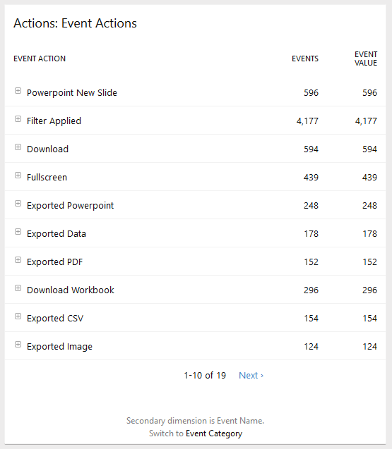
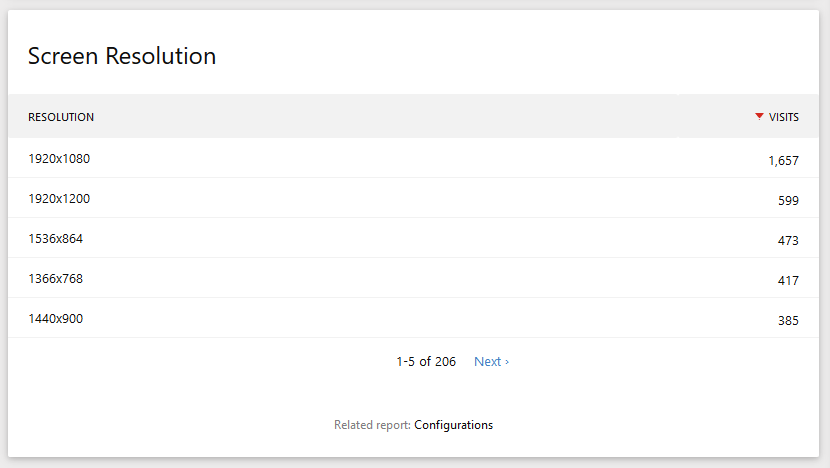
If you’re reading this and thinking to yourself, “Self, this Matomo thing sounds like it might scratch that itch we’ve had,” then we’ve got good news for you. Portals for Tableau has supported both Google Analytics and Matomo for quite some time. The portal’s Matomo integration will not only track usage of each page in your portal, it will also keep tabs on which features are used, such as filters being applied, using the dashboard in fullscreen mode or even downloading it as a Microsoft PowerPoint presentation. It also tracks which devices and screen resolutions the users have, which may come in handy the next time you are trying to pick a layout for your dashboard.

Event Action Tracking

Screen Resolution Tracking

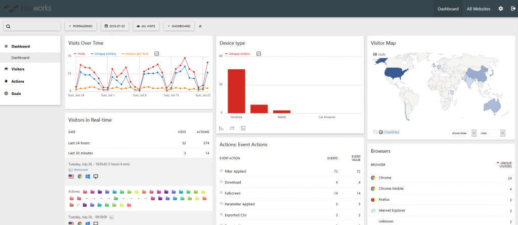
In fact, there is a wealth of information that can be gleaned from setting up your portal with analytics tracking. But even more, if there’s some data you are trying to get from your tracking but Matomo doesn’t have a built-in report for it, the data is still stored on-prem. You can use Tableau itself to connect to the data and slice and dice as you see fit.

Portal for Tableau + Matomo

Connecting to Matomo

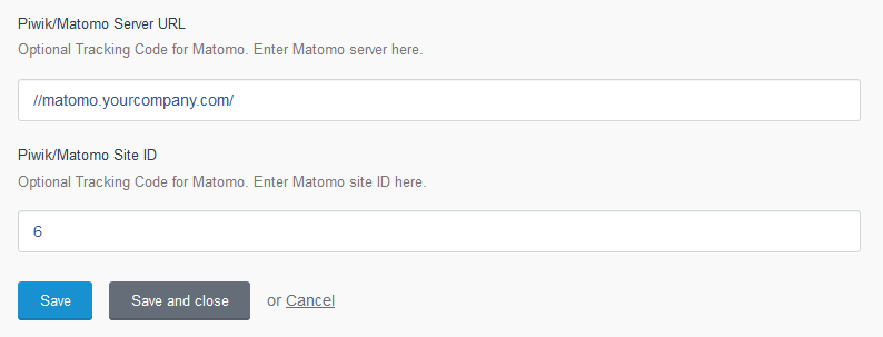
To connect your portal to Matomo, you only need two pieces of information: the URL to your Matomo site and the website ID Matomo designated for your portal.

Matomo Connection

Once you have those two pieces of information, log in to the backend of your portal and navigate to Settings > Portal Settings > Brand tab.  At the bottom of the page, you’ll see the two corresponding fields to enter those bits of information. Once you save, your portal will immediately start sending its usage analytics to your Matomo site.

Matomo Server URL

Disclaimer: InterWorks is not affiliated with Matomo in any way. We just like to provide you with options.

The post Portals for Tableau New Feature Spotlight: On-Premises Analytics Tracking appeared first on InterWorks.

Advance with Assist: Custom Subscriptions with Tableau Server Custom Views

$
0
0
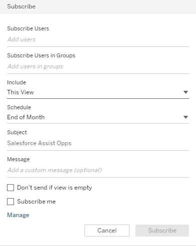
Subscribe Options in Tableau Server

Question for this week:

My users love the dashboards, but they want to get an email with the dashboard filtered to their specific options without having to click the filter. Can we set up a script to send an email to the user with their dashboard needs being clicked automatically?

Over the years, I’ve seen many options when it comes to solving this solution. Using PowerShell and Tabcmd to script this out and having a Windows task running on a schedule to accomplish it. Metric Insights built out a system that allowed customization of dashboard subscriptions within it, and now Tableau Server has also added subscriptions into their setup.

When you log into a dashboard on Tableau Server, you will see a Subscribe icon at the top-right of the screen if subscriptions have been enabled.

Subscribe Icon in Tableau Server

You’ll also notice that the View is set to Original. When you click subscribe, you are subscribing to this specific view. You can subscribe others to the view as the owner or other groups set up on the Server. But you can also subscribe to a custom view of the original dashboard. You just need to create it first.

Subscribe Options in Tableau Server

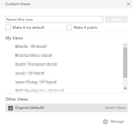
If you change the filters on a dashboard, and then click View, you will be able to save a custom view to the Tableau Server. You can select it to be your default view when logging in and also make it public so others can select it as well.

Custom Views in Tableau Server

Now once you save your view, you will see whatever you named it on the dashboard. When you now click Subscribe, the subscription will send you the custom view you’ve created based on the schedule you select.

As I mentioned before, there are other methods that have been implemented over the years. Here is a blog on Automating PDF distributions with PowerShell and Tabcmd.

As always, if you have any questions about Tableau or just data in general, InterWorks Assist is always open.

Learn More

The post Advance with Assist: Custom Subscriptions with Tableau Server Custom Views appeared first on InterWorks.

PYD63 – Datasaurus Rex David Murphy

$
0
0

First-time host & InterWorks’ representation in Singapore Jia Liu stomps around with Datasaurus Rex David Murphy. David is from England but seized the opportunity to travel the world and ended up in Singapore, where he works and co-leads the Singapore Tableau User Group. Find out what motivates him, what are some similarities and differences being in Singapore’s thriving data community, and the history of the “Datasaurus Rex” name (as well as some hidden meanings…shhhhh).

Follow Datasaurus on Twitter & YouTube.

Dashboards discussed on the show


David’s Other Resources


Jia’s Resources


Subscribe to Podcast Your Data through iTunesStitcherPocket Casts or your favorite podcasting app.

The post PYD63 – Datasaurus Rex David Murphy appeared first on InterWorks.

Flipping the Script: How Starting Small and Specific Changed My Human Trafficking Data Viz

$
0
0

Normally when I build a dashboard, I approach it like a funnel: I start with the big picture first and then narrow into more specific details. This allows viewers to establish context and get the most important insights right from the start and then choose how deep to dive into the details. But when I tried this approach on my most recent Viz for Social Good project, it utterly failed.

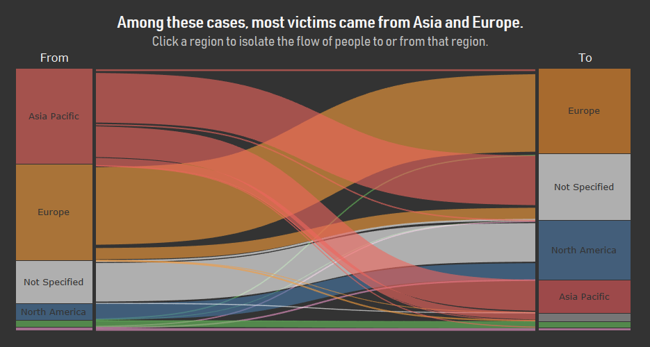
The latest iteration of Viz for Social Good featured a data set about human trafficking, focusing primarily on where and why people are being trafficked. When I initially reviewed the data, I thought it was a perfect opportunity to build my first Sankey chart, showing the flow of people to and from different regions of the world.

Human Trafficking Viz

But the chart didn’t feel very compelling at the regional level – it basically just showed that a lot of people are being trafficked from Asia and within Europe. My quick attempt to change the chart to show flows at the country level looked busy and overwhelming (although Neil Richards submitted a country-level Sankey a few days later that was much better than mine).

As I thought about how to improve the data story, I realized that it felt uncompelling because it was too broad – just a bunch of big numbers that felt impersonal even though they represented real human beings. So, I flipped the script and started small, focusing on one trafficking victim and building the story from there. I felt that this approach did a better job of conveying the magnitude of human trafficking and humanizing the subject.

P.S. In case you’re unfamiliar with it, the Viz for Social Good project was started by Chloe Tseng and periodically releases a data set from a nonprofit organization. Anyone can participate in the project; just download the data set and find a way to visualize it. Then, submit your visualizations on Twitter using the #VizforSocialGood hashtag to spread the word about the nonprofit’s cause and give the nonprofit some new ways to tell their story. Check out the Viz for Social Good website to participate in their next project.

The post Flipping the Script: How Starting Small and Specific Changed My Human Trafficking Data Viz appeared first on InterWorks.

Five Big Takeaways from the 2018 Culture Summit

$
0
0

Anytime it is 110 degrees in Oklahoma, it’s a good time to get the heck out of town for a conference. I was lucky enough to attend this year’s Culture Summit in beautiful (and much cooler) San Francisco, California. This cross-industry conference focuses on ways to increase employee engagement and build high-performing teams. It’s sponsored by some of the engagement platforms we use here at InterWorks, so I thought I’d give it a try. Plus, this year was particularly promising since much of the focus was on remote employee engagement – something I always have on my radar given that InterWorks has quite a few remote employees.

SF Bay

Above: The much-cooler SF Bay.

The Conference and My Takeaways

Some of the conference was devoted to deep-dive workshops. I loved the presentation from David Hassell and Shane Metcalf, founders of 15Five. David noted that the question we should be asking our employees regularly is, “Are you a better version of yourself for having worked here?” This was intriguing to me – does InterWorks make people better? Is this a scary question?

In many ways, we can say that the opportunities we have, especially for folks just starting their careers, are far beyond anything they could find somewhere else. But we are also huge believers in personal responsibility, especially as it applies to things like happiness and self-improvement. My hope is that we simply give people the space to make themselves better. Hmmm. This is definitely a question I want to return to at some point.

Big Takeaway #1: When employees are driven to improve themselves, organizations flourish.

I was also able to sit in on a workshop on preventing burnout by Laura Hamil, Chief People Officer at Limeade. When you have a whole company of Type-A go-getters (ahem, InterWorks, ahem), this can be a huge drain on employee well-being. Laura focused much of this conversation on the importance of one’s manager, as well as the organization, in recognizing and preventing burnout. I was so impressed by this workshop that I’m planning to present the material at one of our Team Meet Ups next month.

Big Takeaway #2: Our most “on-fire” employees are the ones most at risk for burnout.

Pink-Haired Ladies of Culture Summit

Above: Not shocking to find an array of pink-haired HR ladies at the Culture Summit.

There was a fantastic panel presentation that focused on building culture across remote teams. This panel ranged from companies with several established remote offices (Twitter) to companies whose entire workforce is individually remote (Buffer). I jotted down a ton of ideas from this presentation (hello, “unified celebrations” and “gratitude Slack channel”). But, when they spoke about onboarding new employees … well, it was very satisfying to note that InterWorks is way ahead of the curve here. We are basically killing the onboarding game.

Big Takeaway #3: Making remote employees feel like part of the team starts at onboarding, but after that, we must have intentional and consistent engagement strategies for the entire company.

One of my favorite presentations came from Cat Lee, Head of Culture at Pinterest. Who wouldn’t love a presentation from Pinterest? It was a visually stunning, kitschy-in-a-good-way, all around good time. Cat focused mostly on core values – which Pinterest is pretty famous for. They actually use the term “knitting” to describe the way they collaborate within their teams … totes adorbs.

Big Takeaway #4: Core values are the ones actually LIVED across the company, not just written down in a strategic planning session.

Cat Lee of Pinterest at Culture Summit 2018

Above: Cat Lee of Pinterest presenting.

My last big takeaway came from Karlyn Borysenko, owner of Zen Workplace. Early in the week, I had made friends with Karlyn. She’s hysterically funny, whip-smart and had a ton of insight into company culture. Much to the chagrin of our sponsors, her presentation, “Creating Real-Time Employee Engagement Without Spending a Dime” focused on the importance of human connections over expensive technology or engagement platforms. Karlyn’s humor and honesty reminded me of how we try to approach culture here at InterWorks.

Big Takeaway #5: Showing our humanity, being vulnerable and building trust within our teams is the only authentic way to build culture.

Culture Quote

Above: An excellent quote on culture.

Bringing It All Together

Overall, opportunities like the Culture Summit give me a chance to really reflect on ways we can continue to strengthen our culture here at InterWorks. Surrounding myself with other “culture warriors” was just what I needed this summer to kick-start some ideas and keep me focused on the incredible people I get to call my colleagues. Plus, I got to wear a sweater in July – can’t beat that.

The post Five Big Takeaways from the 2018 Culture Summit appeared first on InterWorks.

Transforming Data in Tableau Prep

$
0
0

Picture this: You are trying to build a sales dashboard in Tableau Desktop to show your boss how great you are. But hey, there is one issue: The data you have is currently in a structure not suitable for Tableau Desktop. You need to crosstab or pivot the data on several measures and dimensions. The data source can’t be changed or manipulated at the source level, as it’s on SQL Server or several other departments need the data in that format as it is for other reports.

Sound Familiar? Well, you will be happy to hear that this is the situation that Tableau Prep is made for. No longer will you need to bring in the same data source multiple times and combine the workbook on a tricky blend.

Tableau Prep allows a user to build a workflow that transforms data step by step until it is suitable for Tableau Desktop. This blog post shows how pivoting and joining can clean up data to make it suitable for Tableau. It will show how to simply and easily split data into different Branches, pivot the data on different columns and join these back together.

The Data

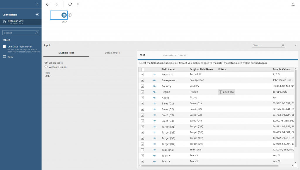
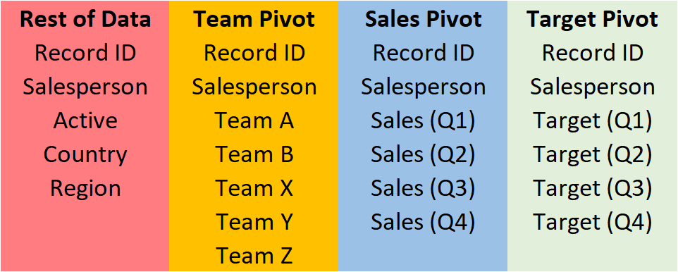
Table 1 below shows the sample data that Is being used. It holds quarterly sales and sales targets for each Salesperson, as well as if they are part of different Teams. The data also holds information on geographical characteristics, as well as if the salesperson is active.

There are four key sections of this data that are necessary for shaping the data for Tableau.

  1. Unique Identifiers

This relates to the column/columns that give the data a unique value. In this case, the Unique Identifiers are Record ID and Salesperson. These can be seen in the Red box in the screenshot below. In this case, using only one of the columns would act as a unique identifier; however, in bigger data sets, more than one column might be necessary. Both will be used in this case.

  1. Sales by Quarter

This located in the Blue box. This is the first of the three pivots that will take place in the workflow.

  1. Sales Target

This data is in the Green box. This is the second of the three pivots that will take place in the workflow.

  1. Team Data

This data is in the Orange box below. This is information on what Team each Salesperson is allocated to. It will be the final pivot of the workflow.

Table 1: Our Data Split Up

Table 1

Workflow Setup

The first step is to connect Tableau Prep to the data source. This is very similar to how it is done in Tableau Desktop. Once the data has been selected, Tableau Prep shows an overview of the data that has been brought in.

In this section, it is possible to edit your data by renaming Field Names, deselecting unwanted columns and filtering data values. This is done via interaction with the metadata interface (located in the Red box).

Figure 1: Tableau Prep Metadata Interface

Figure 1

The other change made to the data is filtering by the Active column. This is because I only want active salespersons. This is done by hovering over the cell which intersects the Active field name and the Filter column (see the Blue box in Figure 1). Once this is done, a prompt will appear to filter the data. This brings the user to a calculation box like in Tableau Desktop. In this calculation only, Boolean calculations can be utilised. The answer can be only true or false. The calculation will only keep the data that is true. The calculation will be the following: The data is going to be edited by getting rid of the column Year Total, as the data will not be required once pivoted.

[Active]=’Yes’

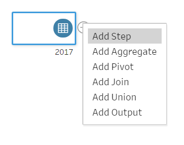
The next step is to split out the workflow into a number of “branches” so it is possible to pivot on the three measures required. To do this, click on the plus (+) on the interface page. This gives the user several options of what they would like to do with the data. See Figure 2a below.

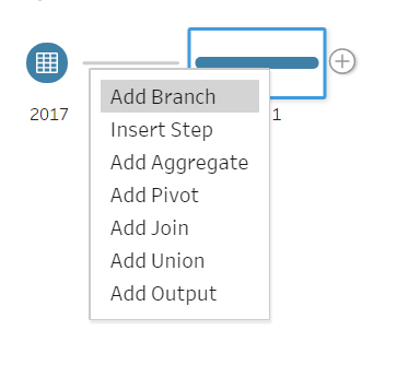
To make the first branch of the workflow, click on Add Step, as this will allow users to make changes to the data. Once you have done this, go back to the same plus (+) and click Add Branch (Figure 2b). This will allow the user to transform the data separately from the original branch. Repeat this step twice more until there are four branches (Figure 2c).

Figure 2a: Add Step

Figure 2a

Figure 2b: Add Branch

Figure 2b

Figure 2c: Branches

Figure 2c

The reason for the four branches is that three are for the pivoting of the data while the fourth is for the rest of the data that is not being pivoted. Although it is possible to do this with three branches, it is best practice to use a fourth, as it prevents confusion by keeping the pivot simple with only relevant data to that pivot.

It is possible to name the branches by double-clicking on the text below each step. The renaming will be the following:

  • Clean 4 – Rest of Data
  • Clean 2 – Team Pivot
  • Clean 1 – Sales Pivot
  • Clean 3 – Targets Pivot


In each of the branches, the columns Record ID and Salesperson will be kept, as these are the unique identifiers and will be used to re-join the data post pivoting.

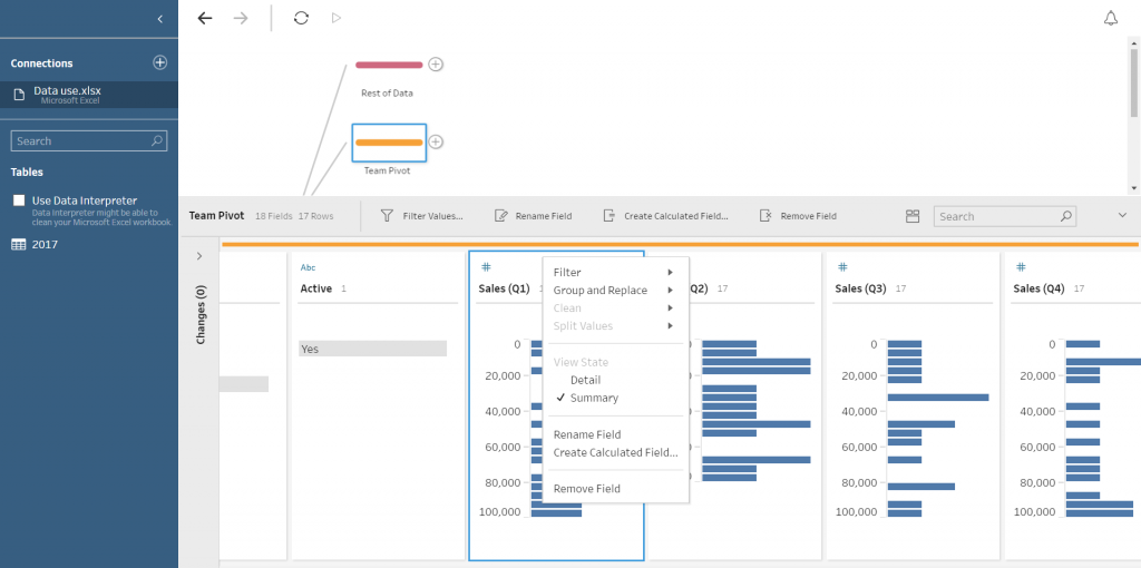
To remove fields that are not required for each branch, the user must click on the step that has been renamed, e.g. Team Pivot. When clicked, a tab will pop up below. This will give a breakdown of the data in each of the columns. In this interface, it is possible to remove the fields that are not needed in this part of the workflow. This is done by right-clicking the field and click Remove Field or highlight fields that are unwanted and click Remove Field above the column headers.

As you remove the fields, you will see a description of the actions in the changes tab (see Green box in Figure 3). These can be deleted to undo specific changes.

Figure 3: Changing Descriptions

Figure 3

The data columns that are required for each branch are as seen below:

Figure 4: Data Columns for Each Branch

Figure 4

Once the unwanted fields have been removed from the workflow. We will begin to pivot the data.

Data Pivoting

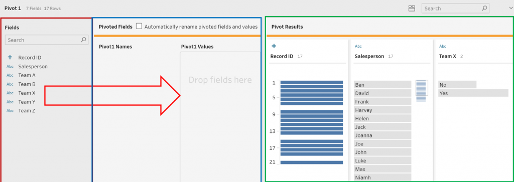
The first Pivot will be the Team Data. This is the team that the salesperson is part of. To do this, click on the plus (+) on the step named Team Data and select PivotThis will add a new step within the interface, as seen in the image below.

The interface within the Red box shows the current fields in the data branch. The Blue box contains the interface where the pivot is created. The values that you wish to be pivoted can be dragged from the Red box to the prompt Drop fields here. When this is done, the fields that have not been selected will be kept in the Red box section. There is an option automatically rename pivoted fields and names by checking the box above this section of the interface.

The Green box shows what the data output would be. This is a good check to ensure that you are pivoting correctly. This can be interacted with; it is possible to split, remove and rename columns here.

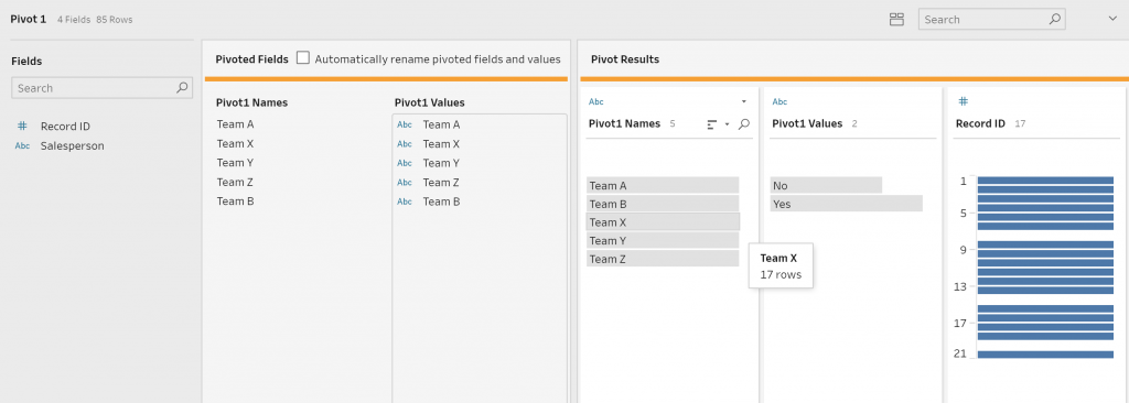
A way to ensure that you are pivoting correctly is to check the number of rows in the top-left corner of the interface. The desired number of rows after the pivot is the number of original rows, multiplied by the number of columns pivoted. In this case, there 17 rows before the pivot and five columns being pivoted. Therefore, the required output is 85 rows.

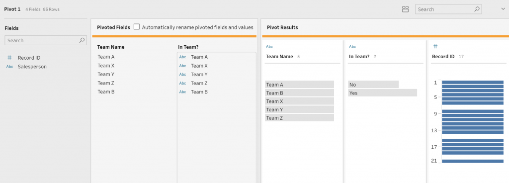
Instructions

  1. Drag the five Team fields into the Pivot1Values box (Figure 4a-b)
  2. Rename “Pivot1 Values” to “In Team?” (Figure 4c)
  3. Rename “Pivot1 Names” to Team (Figure 4c)

Step 1

Figure 4a

Figure 4a

Step 2

Figure 4b

Figure 4b

Step 3

Figure 4c

Figure 4c

Join Pivot to Rest of Data

The next section is to combine the newly pivoted team data to the branch that contains the rest of our data. To do this, click on the step that was renamed Rest of Data and choose the option Add Join. Here we can join the two branches together based on the Unique Identifiers.

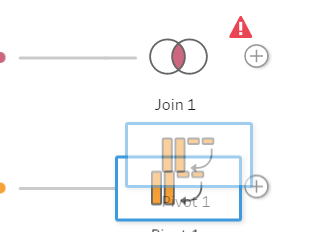
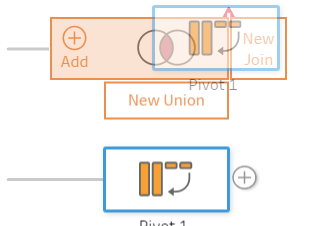
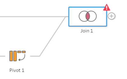
To Join the data, click and drag the pivoted data onto the join, a prompt to ‘Add’ will tab out from the Join step.  Hover over the add and the data will act to join the data together. The data will error at first as there is no data being joined yet.  (Figure 5a, b, c)

Figure 5a

Figure 5a

Figure 5b

Figure 5b

Figure 5c

Figure 5c

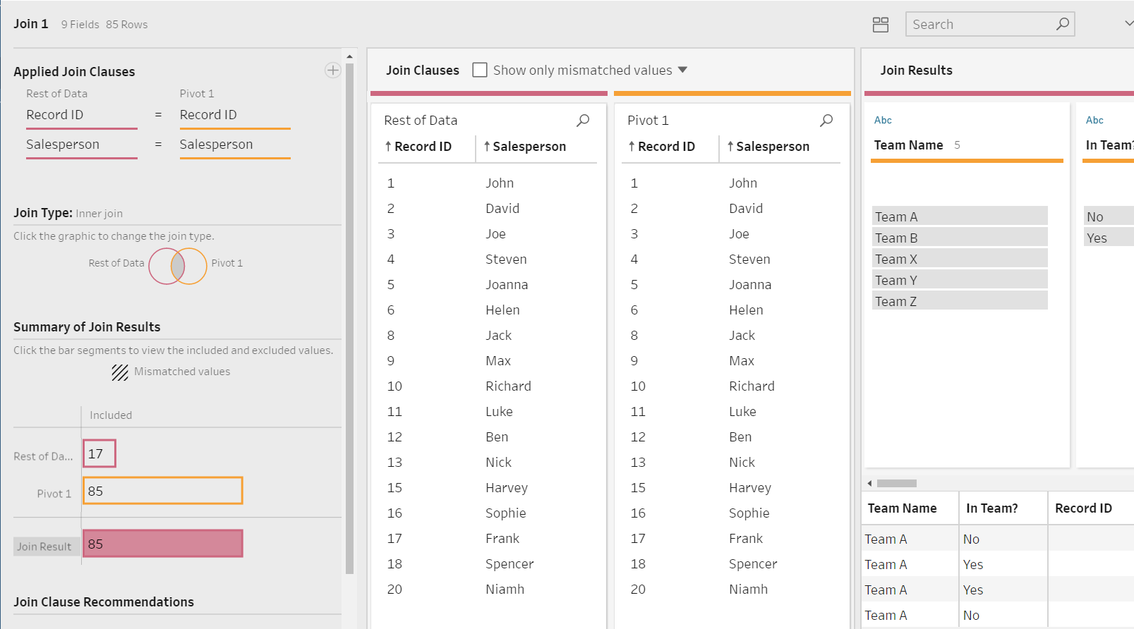
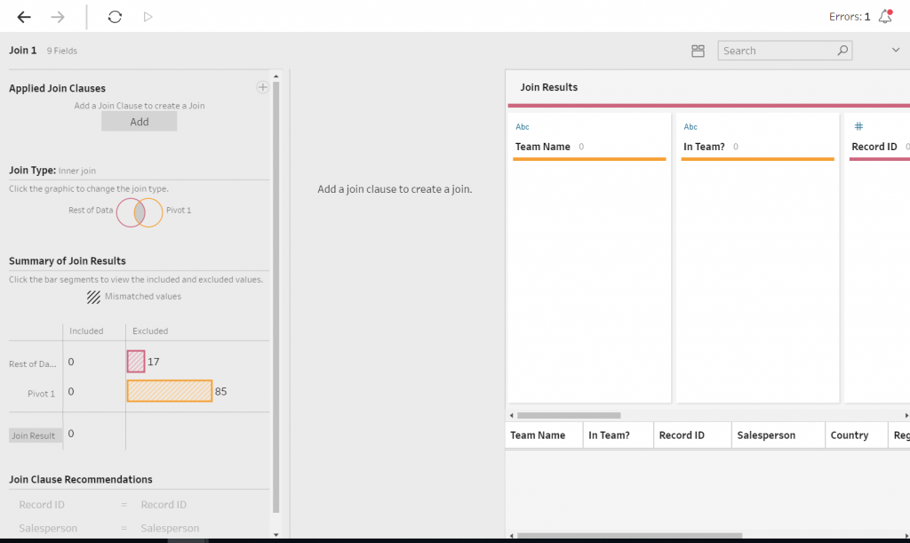
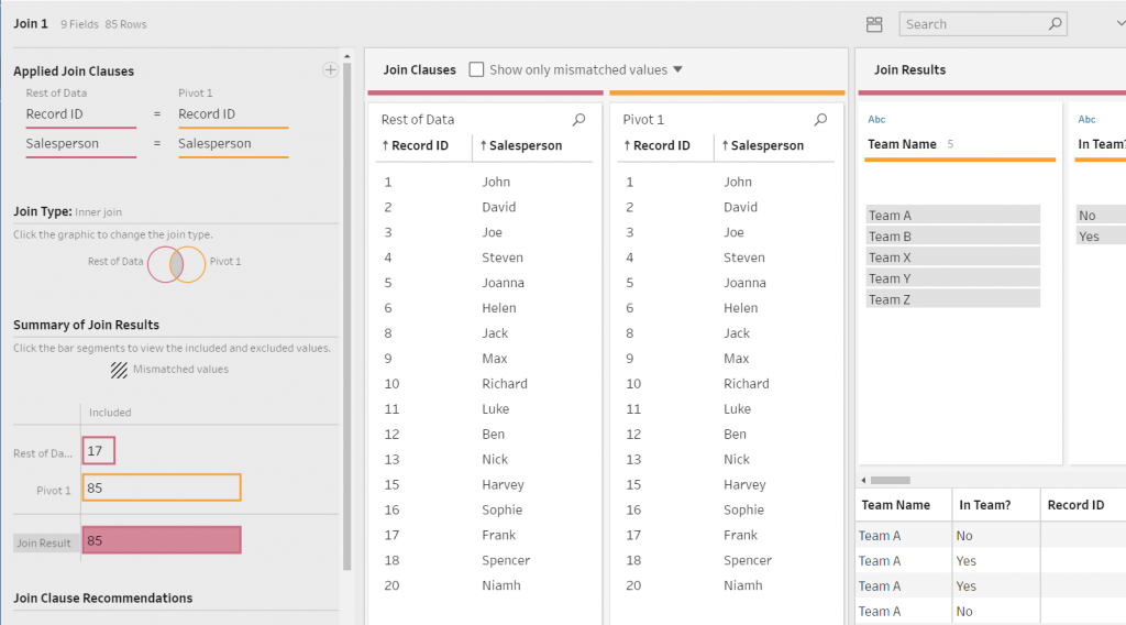
An interface will pop up from the bottom of the screen with options how to join the data. There are options to pick what fields to join on, what type of join is required (Inner Join, Outer Join, etc.). A summary of what has being joined or being mismatched is located here, as well as a recommendation on what fields to join on (Figure 6a).

Figure 6a: Joining Fields

To create a join, click the Add box found under Applied Join Clauses and select the Field Names for each Data Branch to join. In this case, it is Record ID and Salesperson. An inner join will be executed in this instance. Once there has been a join, the interface will convey what values from the joining fields have matched. There is also an ability to view what values have not matched.

The right-hand of the interface contains the breakdown of the data, similarly to previous steps; however, the fields are colour-coded based on what data branch they are sourced from.

Figure 6b: Data Sorted by Branch

The next process is to clean this join my removing duplicate fields. Repeat the steps completed after adding the branches to the workflow.  Any duplicate fields have the suffix “-1.” It is easy to search for this and remove these.

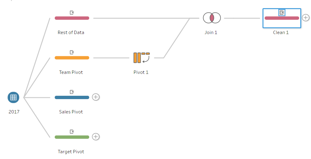
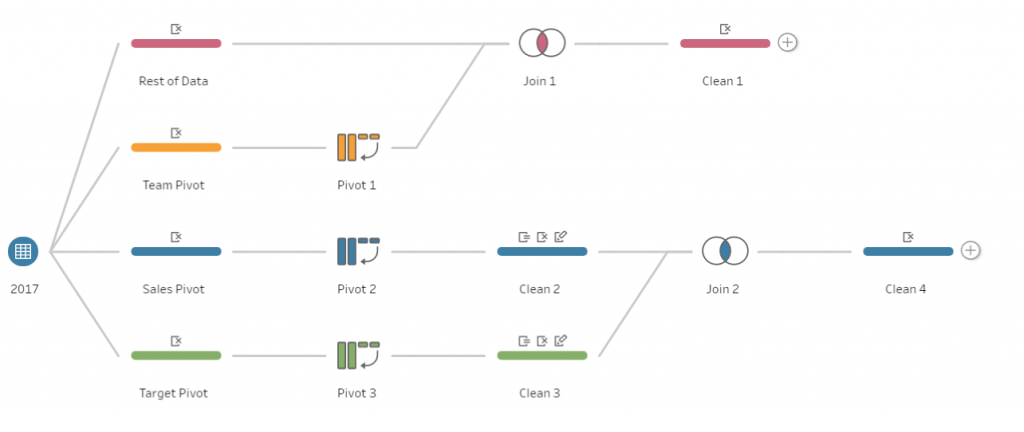
At this point, the workflow should convey something like Figure 7.

Figure 7: Tableau Prep Workflow

Quarterly Sales and Target Pivot

Next is pivoting of the quarterly sales data. The pivot will be a similar process to the Team Pivot. For the Sales Pivot, the Quarterly Sales fields will be dragged into the Pivot1 Values box. Except in this case, instead of renaming the fields, we will add a new step to the workflow. This is because in the Pivot1 Names field, the values read the word “Sales,” plus the quarter; the quarter value is the only value required.

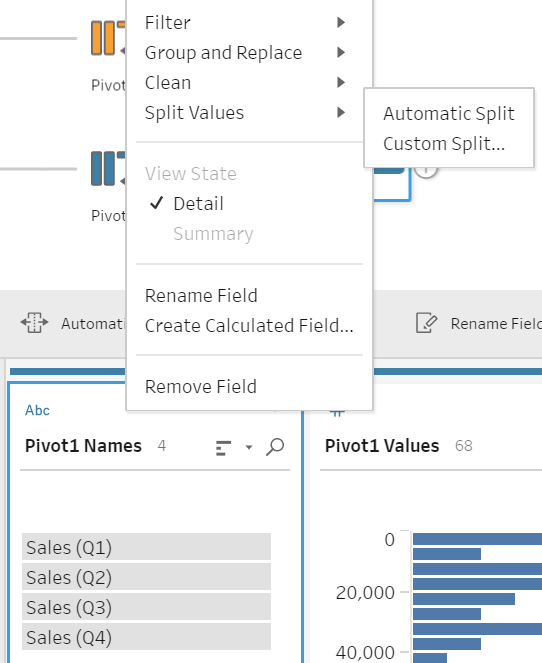
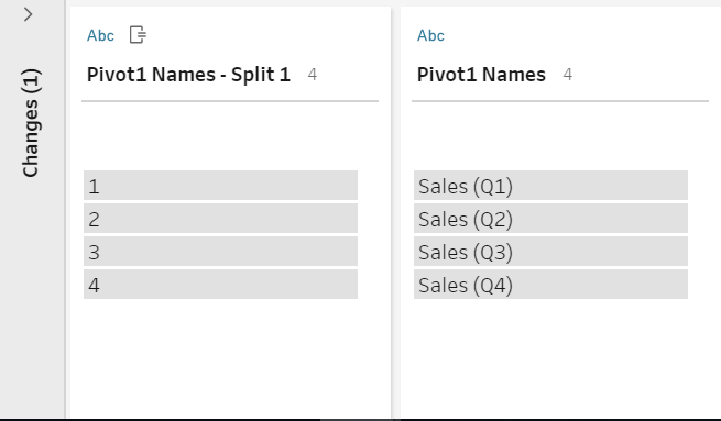
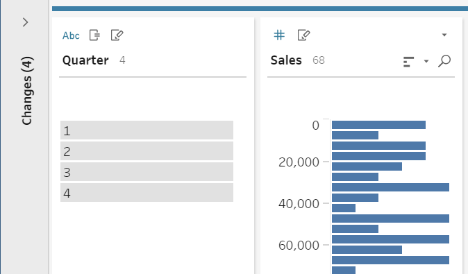
In this new step, we will split the Pivot1 Name field by right-clicking the column, hover over Split Values, and click Automatic Split.  (Figure 8a) This derives a new column, Pivot1 Names – Split 1, which contains values 1, 2, 3, 4 referring to the quarter. (Figure 8b) This is to be renamed “Quarter.” The original Pivot1 Names can be removed, as it is no longer relevant. Pivot 1 Values can be renamed Sales” (Figure 8c).

Repeat these steps for the Target Data:

Figure 8a

Figure 8a

Figure 8b

Figure 8b

Figure 8c

Figure 8c

Joining Quarterly Data

Now that we have pivoted both the Target and Sales Data, we can join these branches together. Similarly to the previous join, we will create a Join step on the Sales branch, Add Target to the join. The only difference is that Quarter will also be joined on to one another as well as Record ID and Salesperson. A step will be added after the join to remove any duplicated fields.

NOTE: When looking at metrics over time, it makes sense to join on the same time record if possible, as this allows more comparisons going forward. Instead of quarterly data, the data could have been yearly or monthly. 

At this point, Figure 9 should look similar to your workflow. So far, the three streams of data have been pivoted on the required fields.  Duplicated fields have been removed, the Team Branch has been joined to the rest of the data, and Sales and Target data have been joined together.

Figure 9: New Tableau Prep Workflow

Figure 9

The next step is to join the combined quarterly data to the branch combining the Team Data and the rest of the data. This is a repeat of the first join. The join will be on Record ID and Salesperson. This is the final join of the workflow. Now at this point, the data is in a shape that is coherent in Tableau. The final step to clean the data fully will be to remove the duplicated fields created from the join

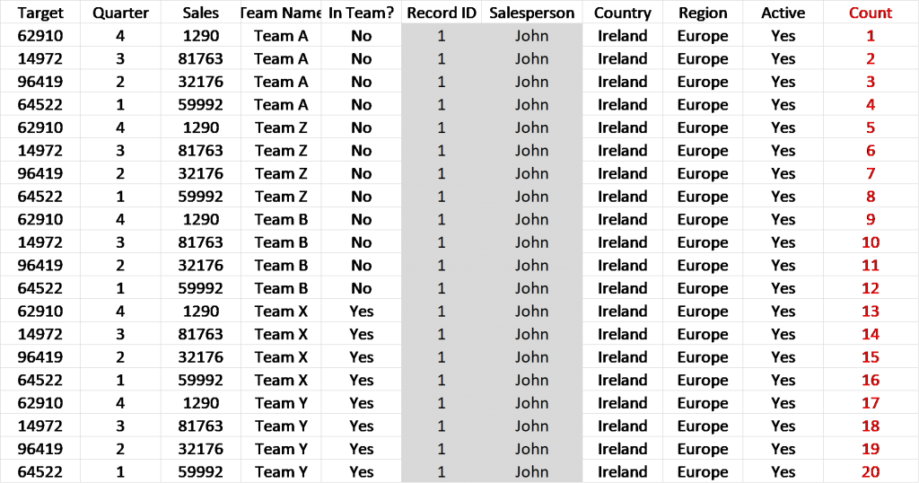
A way to double check that your pivots and joined have been correctly implemented is counting the number of rows a unique identifier is in.  The count should equal the number of fields pivoted by one another (see Table 2). For example, in this case, the Record ID / Salesperson should be seen 20 times (5 teams X 4 quarters).

Table 2

Outputting Data

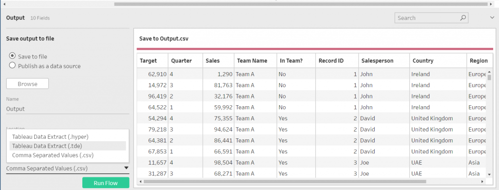
Outputting data is very simple. Click on the plus (+) on the step. Once the data has been fully cleansed, select Add Output. This will bring up an interface that prompts where to save the output, the name of the output and type of file the output is (tde, hyper or csv). To create the output, the workflow is run by clicking the Run Flow button at the bottom of the interface (Figure 10).

Figure 10: Data Output

Saving the Workflow

Similarly, to Tableau Desktop, workflows in Tableau Prep can be either saved as packaged or non-packaged. The packaged workflow (.tflx) will contain the data with the workflow. The non-package workflow (.tfl) will just contain the workflow, but no data will be contained.

For reference, the full workflow should look like Figure 11.

Figure 11: Tableau Prep Final Workflow

A tip for running workflows, once you have created an output but are still developing the workflow, is to make a copy of the output. Without this, the workflow will error if it is being used in a Tableau Workbook. Each time you make changes to the workflow in the development stage, copy and paste the output.

You can download the full Tableau Prep workflow I used here.

The post Transforming Data in Tableau Prep appeared first on InterWorks.


Hidden in Plain Sight: Why You Should Use a VPN

$
0
0

On a recent early-morning bike ride with a good friend and co-worker, I found myself defending my choice to use a VPN on all my personal devices. I realized that my arguments were anything but iron clad and while I could mentally justify the added protection, I could not even begin to explain why I would need such a thing. Who am I to think my personal information is important enough to justify the added expense of funneling all my internet traffic through an encrypted server located in another country?

I promised him at that point that I would write a blog in an attempt to explain my choice and try to prove why you should be using a VPN too.

First Things First, What Is a VPN?

A VPN is a virtual private network that uses a public network to connect users and computers. It encrypts the data leaving your device, ensuring that anyone who intercepts the digital content cannot read it. Think of it like a private road that only you can drive down with walls on the top and bottom, so no one can look in. (I think I just described a tunnel …)

Many businesses use VPNs to allow remote employees to access company resources from outside of the corporate network. It creates a secured tunnel into the network from the user’s machine ensuring nothing falls into the wrong hands.

Aside from your office providing a VPN tunnel into their network, many companies on the internet have begun selling VPN services that allow the general public to route the traffic of their digital world through servers that they have either set up or contracted with all over the world. This means that if you connect your mobile device to a third-party VPN service, you will receive an internet address from the country you route your traffic through. At that point, my computer appears as though it is sitting, not at my home, behind my local ISP’s router, but in the country or city where I chose to connect. More on why this is cool later.

Because the data that is sent out over the VPN tunnel is encrypted from end to end, anyone that was to intercept the traffic can do nothing with it. This is extra important in this day and age when everything is online, from your bank, to the DMV, to your medical records. Much of your private, personal information is being accessed from your computer or mobile device, and most of us have never considered how easy it would be for someone to swipe those packets of data from your insecure internet or wireless access point.

Have you ever joined a public WiFi network at a coffee shop, restaurant or other establishment? You cannot begin to know what level of protection that company has set on their device that is hosting your free access to the web. Chances are, little to no measures are in place, so you are on your own to secure your data.

Another great reason to use a VPN is to access websites that you may not be able to browse to from the country you are located. Case in point, the Tour de France just wrapped up. The U.S. coverage of the sport is spotty and less than stellar. I know many other countries offer free streams of the race, so I told my VPN to connect to a country with free streaming and now my computer looks as though I am sitting in a flat in East London. I did not miss a moment of the action and did not have to pay the unreasonable fee to the U.S. television station selling season passes to watch the race.

One final reason you may want to consider a VPN is to protect yourself if you download media (presumably legally) via torrents. I downloaded one video several years back of an episode of a television show I could not find streaming online. Weeks later, I received a letter from our local ISP with a decree to remove all downloaded material, torrent software and illegal streaming services from my PC. Needless to say, it spooked me. I did as the letter demanded and I have not touched a torrent service since. If I were to ever consider installing such a service again, I would ensure I was shielded behind a VPN.

Why You Need a VPN

What Makes a Good VPN?

I have tried a bunch and there are several things to look for. First, consider the price. You should expect to pay some money for a service. While there are free VPNs, they typically have very small data limits, or they are on unreliable servers where speed is not guaranteed. They also typically log the user’s data. The last thing you want to do is connect to a VPN to protect yourself but not be able to surf the internet because the data transfer rate is too slow.

Look for a service that has lots of remote servers or exit locations. If a service only provides servers in the U.S., you will not be able to use it for getting around U.S. streaming restrictions. Typically, you want a VPN service that has servers located in a variety of countries.

Finally, look for a service that does not log your browsing history. This is important because a government entity can subpoena or request data from a VPN provider. No data logged, nothing to give. Whether or not you are doing anything nefarious, it begs to reason you are using a VPN for the anonymity of the service and logging is extremely counter to that concept. Some countries are more privacy-friendly than others. Romania has long been considered one of the most privacy-friendly nations. A VPN located in this country (the service I use and will talk about below) is hypothetically more secure and less likely to be influenced to give up any user data.

What VPN Do I Use?

I have tested almost every free and fee-based VPN out there. Recently, I settled on CyberGhost VPN for a myriad of reasons. As I mentioned above, reliability of free VPNs is often questionable. I wanted a service with solid performance and speed while meeting the other objectives laid out above. Review after review listed CyberGhost as a leader in both speed and number of exit locations, as well as a veritable HARD ASS when it comes to protecting their user’s data. They do not log any identifiable information and, being based in Romaina, are under no obligation to provide the logs to any government entities that request it.

“Log data: CyberGhost keeps no logs which enable interference with your IP address, the moment or content of your data traffic.We make express reference to the fact that we do not record in logs communication contents or data regarding the accessed websites or the IP addresses.

CyberGhost VPN records exclusively for statistical purposes non-personal data (such as for example, data regarding the utilization degree of the servers), which do not represent in any moment a danger for your anonymity. Such serve exclusively for the improvement of the service quality.

The next contributing factor for me was that CyberGhost built what they call a no-spy proxy data center using an Indiegogo campaign. Since 2014, the NSA-proof datacenter has been fully functional and secure. By doing this, CyberGhost has COMPLETE control of the encryption process from end to end, including the hardware, protocols and facilities, ensuring the highest level of security and protection.

For less than $50.00, I was able to sign up for a year of CyberGhost Unlimited and put VPN tunnels on up to seven devices. The mobile device is easy to use, as is the Windows app, each with dedicated profiles for the most common uses for VPN users.

CyberGhost VPN

When testing speed, my computer and mobile experienced the same network speeds on and off the VPN. This was one of the biggest factors for me, as many of the services I tried before would greatly reduce, if not cut, my data speeds in half.

Getting to the Point

In one paragraph, here is the answer I tried to convey in my ramblings above. The internet is a big and scary place. While you may not think your banking info or medical records would be very valuable to someone, they don’t know that until they have stolen it and damaged you in some way. Stop it before it happens by encrypting your internet traffic with a VPN. Just like LifeLock protects your social security number and credit information, a VPN is insurance for your internet privacy.

If you are interested in trying CyberGhost, hit me up and I will send you a 30-day trial invitation so you can try it for yourself (only three available). One more thing, I have not been paid or endorsed to write this blog by CyberGhost or any affiliates. It is just who I chose after the great VPN trials of ‘18.

The post Hidden in Plain Sight: Why You Should Use a VPN appeared first on InterWorks.
InterWorks Quarterly Event Debrief: Q2 2018

$
0
0

The InterWorks Events Team has been quiet over the last few months, but that’s not due to inactivity! Rather than continuing our Monthly Event Recaps, we decided to give you a wrap up of our events for each quarter. So, without further ado, let’s dive into Q2.

Our Brewalytics series throughout the U.S. went off without a hitch and are still seeing a lot of interest in the hot topic, embedded analytics. Seeing the success of this event, our Australia Team decided they would have their own Brewalytics. Of course, Brewalytics is just the tip of the iceberg. All around the globe, we held all sorts of events ranging from large conference to exclusive movie screenings + workshops. Let’s start things off Down Under.

Australia / New Zealand

The InterWorks ANZ team participated at Tableau’s Data Day Out in Sydney in May where people could get a hands-on opportunity to see Tableau Dashboards in action along with a great number of breakout sessions. This event was an excellent opportunity for hundreds of Tableau users in the area to network and learn some new things.

The week after this event, the team hosted Brewalytics in Perth – our first Brewalytics event in Australia. This gave attendees the opportunity to network over a drink and get an inside look at how they can have a bigger impact on their data with help from Tableau and InterWorks’ team of experts.

The InterWorks ANZ Team at Brewalytics Perth

Above: The InterWorks ANZ crew at Brewalytics Perth.

Europe

InterWorks EU started their quarter with their popular series of events, Data Discovery Days, that occurred in Frankfurt and Munich, Germany, as well as in London, England. These events are fun opportunities for data folks to learn about the potential hiding in their data.

In May, InterWorks EU hosted a D+I+Y London event where attendees had an opportunity to learn best practices, tips, tricks and new technologies. They also heard inspiring stories from some of the best in the data community who can help you on your journey to delivering successful analytics.

Finally, they hosted their very first London Brewalytics, which featured experts sharing how you can get creative with Tableau and how to differentiate your data with portals.

United States

In the U.S., we were busy planning for conferences, movie events in Tulsa and OKC and a Snowflake Series throughout the nation.

Data for Breakfast

We participated in a tour with Snowflake and Tableau across the United States in places like Denver, Los Angeles, Atlanta and Portland. Attendees enjoyed a breakfast and presentations with data analytics experts to hear about the latest big data technologies.

Alteryx Inspire Conference

Our team was well represented at Alteryx Inspire this year, and they had a ton of opportunities to show off what InterWorks does best! Our very own Alteryx Ace Michael Treadwell spoke at a breakout session about the Alteryx Gallery API and how it could be used to extend the capabilities of the Alteryx Server. Several of our trainers also hosted training sessions at the conference itself.

Alteryx Ace Mike Treadwell at Alteryx Inspire 2018

Above: Mike Treadwell presenting at Alteryx Inspire.

Star Wars Movie Events

At our Star Wars movie events this year, we had over 100+ come out to Oklahoma City and Tulsa to hear a little about InterWorks story and what we do in the industry. We all gathered in private theaters with lunch provided to watch “Solo: A Star Wars Story.” There was even a little Star Wars humor within the presentation.

InterWorks IT Movie Event

Above: InterWorks Account Executive Andrew Wooten presenting at an IT movie event.

Community Events

We participated in many community events during this quarter. Two, however, stood out because they were the first time we participated in them. We had our first VMUG event located at Main Event in Oklahoma City where 50 participants attended from the community. We also helped out with the first Higher Education TUG at the University of Colorado in Denver where Ben Bausili shared performance optimization and Tableau Prep tips and tricks to attendees.

Get Ready for a Busy Q3

If you think Quarter 2 sounds busy, just wait to hear how Quarter 3 turned out. Here’s a sneak peek: We will highlight the Tableau Conference – London, a new series on our IT Services side in the United States, an embedded analytics series that took off in Georgia and Texas, and a Data Day Out in Australia. We hope to see you out in the wild at one of our events!

The post InterWorks Quarterly Event Debrief: Q2 2018 appeared first on InterWorks.
Advance with Assist: Blending with Dimension Not Utilized

$
0
0
Correct Numbers Showing

Question:

“I’ve established the data relationship, but the number still won’t show and I still get this error. What am I doing wrong?”

Error Message

Blending is one of those features that we see many issues with. Some users don’t realize they’ve started a blend while others may have unknowingly blended on a field that Tableau automatically established as a relationship, but they didn’t want it. Understanding what is happening during blending is key to the answer to this question.

Above, the question started with “we’ve established the relationship.” This is true. When you open the Data > Relationships menu they saw a relationship defined.

Relationships Pane in Tableau

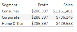
The view though didn’t reflect the relationship with the numbers as every segment was showing the exact same value.

Same Value Showing

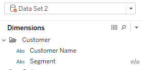
Once, on a screenshare, I noticed that they could not see the secondary source in the top-left of their desktop as the drop-down was showing only the primary source.

Data Set 1

Dragging the Connection pane down a bit to expose the secondary connection made it easier for them to see what pills related to what datasources with the checkmarks.

Once we opened the secondary datasource, the answer to this question is that the link to the blended dimension was not initiated.  This could have been an accidental click, or perhaps the dimension they were blending on wasn’t used in the view. But once we turned the relationship on, we were able to then get the number to show correctly as they intended.

Data Set 2

Correct Numbers Showing


Sometimes, just having a second pair of eyes to quickly diagnose something is your best friend. Your time is too valuable not to have InterWorks Assist on your team.

The post Advance with Assist: Blending with Dimension Not Utilized appeared first on InterWorks.

Tableau Tip: Default to Current Week and Allow Week Selection

$
0
0

The idea behind this blog post is to document a novel approach I have come up with to allow for date selection in a report that defaults to the most recent time frame. There are multiple ways this sort of problem can be solved. My solution has likely been done by someone else in Tableau and they came up with a catchy name for this trick, but for now, I clumsily refer to it as “that thing where you use an LOD calc and put the action filter in context,” or LOD+AFIC. Feel free to comment with a better way to refer back to this process.
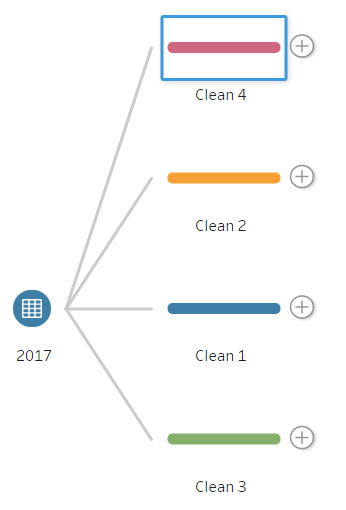
Consumer Complaints Example

Rather than start with a detailed explanation, check out the example below. The report defaults to showing information for the most recent week in the data set while allowing the user to quickly filter to prior week(s) by clicking on the line chart. This dashboard shows the number of consumer complaints reported to the CFPB (Consumer Financial Protection Bureau) with the most recent week’s complaints shown in all but the line chart above the map with the complaint count by week for the last 104 weeks (2 years) displayed. The data behind this is a static sample, but it would be most useful when hosted in a Tableau Server environment where the data source behind the dashboard was regularly updated and the displayed portion automatically rolled forward to show the most recent week/day.

Background on LODs

Ever since LOD calculations were introduced in Tableau, one of my favorite tricks was setting a dashboard to automatically update to show the most recent time period in a dashboard based on the most recent date in the data set. Where this would fall short was when a user would want the ability to see the report for a prior time period or range of dates. My options then were often to either add a parameter switch to allow for date selection or use a relative date filter. Both of these become problematic if the user wanted to select a particular timeframe, let alone expand how far back the timeframe went.

The relative date filter also was not a good fit for data sets that were updated intermittently, such as on a weekly basis since the anchor date had to be set in reference to today or a fixed date and could not move relative to the data set. This example allows the report to default to the most recent week but allows the user to easily select a prior date or range of dates and see the report update. I have moved away from having the user interact with a filter menu and instead use an action filter to quickly select a week(s) of interest. Personally, from a design standpoint, I want the user to explore the data as much as possible without having to make a selection in a drop-down. When you select a week with an action filter, you make an informed choice with an understanding of what was happening that week and the weeks around it. When a user selects a time frame from a filter menu, they lose this context.

So, what all is going on here?

How to in Tableau

Parameter

A parameter-driven calculation is set to show the most recent 104 weeks with the number of weeks adjustable based on a parameter. The last two years is likely a more than sufficient timeframe for the average user, but I left the parameter displayed for the edge cases that want to go all the way back. The calculation checks if a date is older than the number of weeks in the parameter input from the max date.

Weeks Displayed Filter in Tableau

Now that I have trimmed down the timeframe, we can move on to the fun part which involves two components: an LOD calculation to respond to the number of weeks selected and a date-based action filter set to be in context.

LOD Calculation

We need this calculation to do two things: return only the most recent week when all weeks are selected and, when less-than all-weeks are selected, let everything through for the action filter to decide what to show.

Selected Week Filter in Tableau

Action Filter

Once the filter above is in place, we can set things up in the dashboard. We just need to add a basic action filter to pass through a date value from the timeline. After it has been applied, right-click on the filter and select Add to Context. To avoid having to repeat this on each sheet, we can right-click on the action filter, select Apply to selected worksheets and push the in-context version out to the relevant sheets.

Week Action Filter in Tableau

After that the dashboard is ready! The only major caveat with this sort of setup to keep in mind is that if the number of weeks in the parameter exceeds the range of the data set, the charts default to showing everything as called out by the date range displayed in the top-right corner instead of just the most recent week.

Map and Bars?

This dashboard repeats some of the same information in the map and “by state” bar chart. So, why waste space with repetition? The map is in place for visual interest and helps with the understanding of geographic presence when filtering by company. The bar chart allows for a quick ranking comparison and a place for records not shown on the map of the continental U.S. (Puerto Rico, Hawaii, Alaska and N/A). A highlight action filter helps link the state selection from either chart.

The post Tableau Tip: Default to Current Week and Allow Week Selection appeared first on InterWorks.

InterWorks Blog Roundup – July 2018

$
0
0

Great balls of blogging fire! July was a busy month on the InterWorks blog … like, 30 posts and 27 different contributors type of busy. Our team didn’t just turn up the volume either, they also turned up the quality. With a laundry list of Tableau vizzes, tips and general musings, there’s enough Tableau reading material to keep your lunch breaks busy for a hot minute. Of course, we also had some excellent podcast episodes covering the growing Tableau community in SE Asia, Alteryx Inspire and even the practical applications of machine learning. There are plenty of other topics to boot, like a series all about taking control of your data privacy, so get to reading!

News & Events


Tableau Vizzes


Tableau Tips and Tricks


Embedded Analytics


Power Tools For Tableau


Podcast Your Data!


Data Privacy


Snowflake


General IT


The post InterWorks Blog Roundup – July 2018 appeared first on InterWorks.

Viewing all 2697 articles
Browse latest View live