Quantcast
Channel: InterWorks
Viewing all 2697 articles
Browse latest View live

Dashboard Design Comparison: Tableau Desktop vs. Microsoft Power BI

$
0
0

The objective of this comparison exercise was to rebuild the Overview dashboard from the Tableau – Superstore sample dashboard in both Tableau (10.4) and Microsoft Power BI (2.52) with no prior knowledge of the Microsoft analytics package. I decided to conduct this comparison to better understand one of Tableau’s most-talked-about competitors and to gain some knowledge of its feature set. The findings and conclusions taken from this solo exercise are my own and do not reflect – nor were they knowingly influenced by – those of anyone else.

It’s tough to stay objective in this technological age. If not impossible. My tribalistic tendencies towards Tableau is unquestionably significant in this exercise, especially since I began with the market’s common knowledge that Power BI features less functionality, is less usable (Tableau’s flagship characteristic) and looks less pretty. This forced me to stay vigilant, be pragmatic on each issue and explicitly look for the good in Power BI.

Overall, my perception of Power BI before having used it wasn’t far wrong. That said, the exercise did not put me off the Microsoft product – and I won’t be caught in any heated pub debates with Microsoft BI consultants any time soon.

The exercise mainly highlighted how spoiled we are as Tableau users. If we right-click an axis, a menu appears offering all the functionality required to edit that axis exactly as you require. Want to alter the tooltips on this chart? Click the obvious tooltip mark and edit away in a rich text editor! The main takeaway was that Microsoft’s product didn’t have this feeling. It felt like either functionality did not exist (tooltip editing) or the places to access the functionality were hard to locate (axes editing) and required searching the web.

The goal here was not to become an expert in Power BI, so some corners were presumably cut that may have been possible with further searching the web and/or more knowledge. I also did not aim to guinea pig all Power BI functionality, so I imagine there are many good – and potentially not so good – features not touched in this exercise.

The task of reproducing one of Tableau’s example visualisations should also be noted in Power BI’s favour. Connecting to Data

Googling Power BI vs. Tableau

Opening Power BI, you are greeted with a similar interface to Tableau. "What data do you want to use?" Power BI has 45 native connectors, compared to the 69 currently available in Tableau. Since I’m connecting to Excel, I selected it from the top of the list and was greeted with the Navigator. I chose the Orders table (sheet) and could preview the data. All this was in line with Tableau functionality.

Clicking Edit on this page opens the Query Editor page, which I like. Users can add new tables to join to (not discussed in detail here as just looking at one sheet). They can also perform complex transformations such as grouping by values and summarising the data to a defined aggregation, changing data types, removing duplicate rows, pivoting columns, replacing values, etc. 

Power BI Query Editor

Power BI > Queries > Orders

Tables can be added from your data source and combined here. This functionality is an area where arguably Power BI appears to be as strong, if not stronger than Tableau. Microsoft’s Query Editor has pulled from their Excel and Power Pivot functionality back catalogue and added an impressive number of transformation features that don’t appear so front and centre in the Tableau GUI. If you are well accustomed to similar Microsoft products, you are sure to find this experience helpfully designed and generally intuitive. That said, a large number of these features are formatting alterations and features that Tableau displays in subtle drop-downs on the columns themselves or are simple to create in calculations.

Tableau drop-down

If push comes to shove (bias aside), I would say that Power BI’s blunt force approach to showcasing their feature set in the classic ribbon is preferable to Tableau’s hidden options and is far more obvious to a first time user. However, with Project Maestro close to release, Tableau are set to add a powerful and visual data prep tool to their armoury. Maestro will allow for visual data profiling and the construction of data wrangling workflows.

Unfortunately, this exercise didn’t require me to use these features extensively. I merely clicked Load and was shown a blank canvas.

Building the Map

Power BI vs. Tableau Map

Arguably, I chose the hardest viz to build first. This may be why I found it the most frustrating.

Tableau

  1. Double-click the Longitude and Latitude fields.
  2. Create a Profit Ratio field by clicking Create Calculated Field and entering simple formula: SUM([Profit])/SUM([Sales])
  3. Drag this new field on to Color and Sales on to Size cards.
  4. Drag the Country, State and City hierarchy onto the Detail card.
  5. Tweak the Size slider and make the colours stepped with max and min at -50% and 50%. Add halos.
  6. Alter the map layers to show the objects required and alter the design to be as neat as possible.

Power BI

  1. Select the map icon in the Visualizations pane.
  2. Right-click the Fields pane and create a new hierarchy for Country, State and City.
  3. Drag into the Location card and select City.
  4. Create a new measure, also in the Field pane, and type the following into the Excel formula box that appears: Profit Ratio = SUM([Profit])/SUM([Sales])
  5. Drag Sales on to Size and Profit Ratio on the Colour Saturation card.
  6. Find this icon and click it: Power BI Icon
  7. Expand Data colors and set the minimum and maximum a la Tableau. Set Diverging = Yes.

Number of steps-wise, this wasn’t too painful. However, I have several significant annoyances about the resulting viz:

  • Vienna is not in the US. I know there is a Vienna in the U.S., but it’s the capital of Austria. I expect Bing to know this and handle it accordingly, especially since we went to the bother of creating a hierarchy for Power BI to use. After wasting 20 minutes trying to fix this using Google, I moved on.Power BI vs. Tableau Map Drilldown
  • The minimum size of the marks is massive. Tableau makes a nice-looking map here. The circles don’t need to be large to get noticed as we have applied halos to make them stand out against their competing cities. This makes the viz look really messy and doesn’t highlight large differences in sales values between cities.
  • Five map styles. Power BI has a small list of styles such as Dark and Aerial (good name, by the way) with no customisation therein. In my example below – the closest one I could get to Tableau’s – the motorway labels and, oddly, small-town names are apparently mandatory. And if you wanted to know where the Celtic Sea is, this map’s the map for you.

Building the Area Chart

Power BI vs. Tableau Area Chart

Tableau

  1. Drag Order Date to Columns and make it a continuous month.
  2. Drag Sum of Sales to Rows and make the chart Area using the Marks card.
  3. Drag Category to Rows to expand this axis; one per category.
  4. Make another calculated field called Order Profitable and use the calculation in the comparison below. Drag this onto Colour and set colours for true and false accordingly.
  5. Edit the aliases to be Profitable and Unprofitable.

Power BI

  1. Under Visualizations clicked Stacked Area Chart.
  2. Tick Order Date. Under Axis, untick Quarter and Day so these can’t be drilled in to.
  3. Drag Sales onto the Values shelf.
  4. Create an Order Profitable? column and add it to the Legend shelf.
  5. Click the Power BI Icon icon to drill into month and year. The other one just gives you months (discrete).
  6. Remove the legend and alter the colours.
  7. Put the Category on the Filters shelf and select Furniture. Put a text box next to your chart containing the axis label Furniture and repeat the above six times for each Category and Segment. (Copy and paste also works, too).

The number of steps here is infuriating, given that you have to build each one, then size and position it on the canvas. How does Power BI support a productised report that doesn’t know what dimension values will need to be split out? What if there’s a new segment in the data tomorrow? I don’t know.

How does Power BI fit all six dashboards to that they fit the height of the dashboard equally? I don’t know. There is a Distribute Horizontally button, but it didn’t seem to do anything when it was clicked in my scenario.

The Calculation

In the above, it was necessary to provide each tool the complex calculation of providing the total profit per order ID. In Tableau, this is a Level of Detail expression. These aren’t the easiest to get your head around initially, but I find them intuitive enough at this stage. Power BI uses DAX expressions (data analysis expressions), again borrowed from SSAS, Power Pivot, etc.

Calculation example

The ALLEXCEPT in the above throws me off. Both expressions are aimed at making the software perform a calculation outside the data in the viz already by constructing another table of data to aggregate over.

Again, I’m biased, but I believe it boils down to:

  • Are you a Microsoft fanboy/fangirl? You’re probably comfortable with DAX already. If not, the syntax is within your wheelhouse.
  • New to Tableau? Do a bit of learning. This is "advanced" and not as intuitive as the rest of Tableau, but it’s not that bad. Suck it up and watch a YouTube video for 20 mins. You’ll be fine.

Building the Summary Table

Tableau

  1. Drag Measure Names on to the Columns shelf.
  2. Drag Measure Values on to the Text card.
  3. Right-click and format each element accordingly.

Power BI

  1. Click Table from the Visualizations pane.
  2. Tick the columns you’d like to include and aggregate where necessary.
  3. Format in the Power BI Icon tab as appropriate.

Let’s be honest here, Tableau’s method of dealing with tabular data is not intuitive. The hack to remove the Abc from the final column is annoying and the clumsiness of the entire interaction could be improved. At this point in Tableau’s roadmap, it’s clear this is a design decision aimed at pushing users away from building big, gross tables. While I understand this, it seems pushy and somewhat naïve.

Power BI’s method is nice. Build out the table by clicking a field and adding it per dimension in there already. It seems pleasingly responsive and does what you’d expect. Make the text large using the "formatting" pane, and then … oh … resize everything manually again. It was going so well …

Also, worth noting, there’s no option to provide a format mask in the viz that isn’t in the data. So, if you want to have a field that holds a percentage with two decimal places, but only show the whole number in the viz, it must be two fields. This is unpleasant and costly in terms of performance and data quantities.

Bringing It All Together

Creating actual dashboards using Power BI was fairly intuitive. Where Tableau’s method of invoking containers to structure the dashboard sometimes feels clunky and frustrating (but in the long run is worth it), Power BI has a basic snap-to, floating approach that feels easy. This did become quite annoying when resizing my six area charts, but it didn’t take me that long to sort this out. I’d worry about the ability to build something intricate with confidence, however, and again building out data sets where you don’t know the dimension values would be tough.

In Tableau, designers make single worksheets and combine them into dashboards. Power BI encourages users to design all their worksheets (or charts) on the same canvas and combine aesthetically – or functionally – as they go. I don’t have any strong feeling about this upon finishing my first Power BI dashboard. As a Tableau user, it’s fine. It works and it’s easy to understand. I’m sure it could be frustrating, but Tableau’s containers are far from perfect. Power BI does allow for overlapping worksheets, which could be useful.

Power BI vs. Tableau Dashboard

Conclusion

As Tableau users, we’re spoiled. So, it doesn’t do tabular data all that well, and you can’t do major transformations on the data set (yet). As a data visualisation tool, however, it’s the best I’ve used. The ability to imagine how you think it should behave and it actually behaving in line with this almost every time is the big difference between Power BI and Tableau.

In Power BI, I found myself clicking, right-clicking and shift-clicking on elements of my dashboard then nothing happening. It blinked at me. Over and over again. Where Tableau would think “What’s that? You want to make that title bold? Sure, here’s the menu.” In Power BI, you’re expected to trudge the long, arduous journey to the formatting panel and find the element you want before making the alteration.

There are some major functionality flaws mentioned in the above around geo-coding (sorry Bing Maps) and multiplying charts in a particular axis that I believe are enough to justify a low functionality score here. The Show Me pane in Tableau is a sales tool in my opinion, and I regularly tell customers to avoid using this, encouraging them to build up their Tableau chops manually as all these provide are presets of dimension and continuous variables on different shelves. The ability to find a sense of "flow" in the product is what sets it apart and gives the user that feeling of deep satisfaction when they create something neat. In Power BI, the Show Me equivalent seems to be the main way of creating chart types.

If you can think of it, it seems Tableau can do it. I feel Google and Tableau have the skill of making truly intuitive UI experiences that allow you to guess with real accuracy, and later – once you’re more comfortable with the product – allow you to really create rather than simply build. With Microsoft products, you become an expert by trudging through "advanced" controls and ribbons hidden in the "developer" backwaters, and Power BI is no exception. Here are my final scores for Power BI and Tableau respectively:

 Power BITableau
Usability68
Aesthetics710
Functionality68
Total1926

Event Debrief - March 2018

$
0
0

March wrapped up in a blink of an eye and we have tons to share about our events that happened last month. Throughout the nation, we hosted events both small and large to audiences interested in IT and data. The InterWorks team’s representation did not disappoint!

IT Transformation – Lawton

At the beginning of March, we had InterWorks Account Executive Russell Parker speak to the small town of Lawton, Oklahoma, about IT transformation and a way to turn IT into a competitive advantage.

IT Transformation Event with Dell EMC - Lawton, OK

Above: Russell Parker speaking at the Lawton IT transformation event.

OSU Big Data Conference – OKC

In the middle of March, Data Practice Lead Brian Bickell joined a panel covering issues and lessons learned in setting up an analytics infrastructure in an organization at the one-day OSU Big Data Analytics Conference in Oklahoma City, Oklahoma, at the National Cowboy and Western Heritage Museum.

“The audience was a mix of local industry and of MBA students from OSU. As for value the audience got – hopefully, they took away some points to think about when developing analytics systems in their own companies.”

- Brian Bickell, Data Practice Lead, InterWorks

Tulsa Area Schools Technology Symposium (TASTS)

The OSU Big Data Analytics Conference wasn’t the only conference InterWorks participated in last month. InterWorks Solutions Architect Ideen Jahanshahi hosted a discussion around optimizing backups to ensure instant recovery and minimal data loss in the event of an outage at the sixth annual TASTS in Tulsa.

InterWorks Account Executive Andrew Wooten also attended the event and shared his perspective on how being a part of conferences like TASTS adds value and helps InterWorks tell our story.  

“We connect with the audience by sharing our experience working with clients in similar situations. We explain the approach we take and the technologies we support. The value for InterWorks is the ability to reach a broad audience and showcase our expertise as a partner.”

- Andrew Wooten, Account Executive, InterWorks

TASTS Event in Tulsa - Veeam Presentation

Above: Ideen Jahanshahi speaking at TASTS about Veeam.

While this seems like a ton of events already, we aren’t even halfway finished with the events that happened in March!

Data For Breakfast with Snowflake – Portland

InterWorks Global BI Practice Director James Wright spoke to an audience of early risers in Portland, Oregon, about the latest data warehousing technology from Snowflake. InterWorks Account Executive Matthew Mendelsohn attended the breakfast and shares his insight on the event.

"Events like this one give the audience a chance to interact with others going through a similar data journey. It also gives them the ability to have non-biased conversations with peers.”

- Matthew Mendelsohn, Account Executive, InterWorks

InterWorks + Snowflake Data for Breakfast in Portland

Above: James Wright speaking at the Data for Breakfast event.

Tableau + InterWorks Happy Hour – Montreal

As the data community gathered in Montreal to attend Datavore on March 20, Tableau and InterWorks invited attendees to join them for a happy hour event at Hotel 10 in downtown Montreal.

“While many participants knew of InterWorks, thanks to our strong online presence, the event gave us the opportunity to introduce ourselves on an individual level and explain the wide range of services we offer. In addition, we had a chance to address the participants in both English and French – an additional local connection very important in that community.”

- Martin Plourde, Analytics Consultant, InterWorks

According to Martin, it was interesting to hear simultaneous conversations in French and English, with everybody talking about data as well as the similar opportunities and challenges they all share. 

IT Spring Lunch and Learn Series – OKC, Tulsa

In February, we kicked off our first part of this event series on infrastructure, and the second part of this event was just as successful as we had Jorge Motoshige from Dell EMC speak to our groups of 60 + in both Oklahoma City and Tulsa.

"Events like the Spring Series are some of the best ways we stay engaged with our partners. These events help them keep us at the front of their minds when they think of the best utilization of technology.”

- David Burch, Account Executive, InterWorks

InterWorks + Dell EMC Big Data event in Tulsa

Above: Jorge Motoshige speaking at the Tulsa lunch and learn.

Interested in what’s been going on on the Europe side of events with InterWorks? Well, look no further, because the Events Team has been just as busy with their lineup!

BME – Düsseldorf

The BME eLösungstage is the largest event for procurement and eSourcing in German-speaking countries. At this year's event, attendees had the tools and guidance they needed to get their purchasing and supply chain management right for their digital future. InterWorks provided practical examples of how to make digital transformation their companies agile and directly out of purchasing, with and without IT.

InterWorks at DME Dusseldorf

Above: InterWorks EU's European Business Developer, Markus Müller (right), at BME.

Data Discovery Day – Köln

We hosted yet another free Data Discovery Workshop in Köln. Interactively, we showed a full audience how to improve data analysis and data visualization in their businesses. Our trainers showed the most important features of Tableau Desktop through a series of example tasks and familiarized attendees with the operation of the software.

Data Discovery Day in Köln

Above: A full Data Discovery workshop in Köln.

Tomorrow's Analytics Today – London

Snowflake and InterWorks joined forces on Tuesday, March 27, for a breakfast seminar on "Tomorrow’s Analytics Today." As data volumes grow and demand for analytics expands, many organizations are wondering how the cloud can help them to plan for a more scalable future. The cloud data warehouse is one of the most important components of any cloud data strategy, but matching technology to needs can be difficult.

At this event, attendees heard all about Snowflake – the data warehouse built for the cloud – and how InterWorks can help them achieve their goals using Tableau and Snowflake in conjunction.

Tomorrow's Analytics Today - London

Above: InterWorks EU's Director of Enterprise Solutions, Kevin Pemberton, speaking in London.

After all these successful events, you would think the next month might slow down; however, April might be even busier than March when it comes to events! We can’t wait to share what we have coming your way with events this month, so stay tuned!

Questions from Tableau Training: How Can I Draw a 45-Degree Angle?

$
0
0

"How can I draw a 45-degree angle in Tableau, starting from the lower left-hand corner of my view and ending in the top-right corner?"

This question came from Ece during a Desktop III class in Atlanta, as well as Christa and Erik from a Visual Analytics class in Boston. This must be a popular topic!

Perhaps you are trying to draw a line all the way from zero to a fundraising goal, or maybe you are trying to figure out who is above or below a certain threshold. Whatever the case, this will allow us to draw a line from zero to our goal or final amount.

Creating Our Calculation

While this task is straightforward with a scatter plot, this approach did not work for our use case: viewing data over time. However, by utilizing our helper functions in Tableau, we can create a calculation that will draw a line from zero all the way to the last point in our data.

Tableau: 45-Degree Angle Calculation

What this calculation is essentially doing is looking at our time series and determining what is first and last in the view. For our first mark, it will simply plot a mark at zero. For our last mark, it will plot a mark at our last sales amount. For everything else, it will simply be null, which is important. We don’t want the 45-degree line to consider any highs or lows in other months.

Plotting Our Line

Once I have my calculation, I can drop it on Rows next to my sales amount and add a trend line between my two points (right-click on one of your dots to add the trend line). I am not going to synchronize my axis; as you can see, my sales axis is much higher than my 45-degree angle line’s axis.

For some other formatting changes, I can decrease the opacity of my color on my 45-degree angle line, change the color of the trend line and hide my null indicator. You can also completely hide that second axis if you so choose.

45-Degree Angle Line Visualized in Tableau

Thanks for the great question, Ece, Christa and Erik!

Portals for Tableau New Feature Spotlight: Overriding Settings by Tableau Group

$
0
0

Not only are Portals for Tableau useful to the people inside your company, they’re also great for sharing information with your partners, customers and any other stakeholder you may have outside of your company.

One way that portals have become a go-to product for sharing with anyone, or everyone, is that they have always provided a way to white-label your analytics. Whether you don’t want people to know your secret weapon is Tableau, or you use multiple reporting platforms and need a tool-agnostic place for your users to go, Portals for Tableau is up to the task.

This is the point in an infomercial when the host would say, “but wait, there’s more!” This is a blog post, not an infomercial, so I won’t do that, but you’ll know I wanted to in my heart … moving on!

Introducing New Group Override

Many of our portal clients have asked if there’s a way to customize the portal based on who is logged in at the time. An example is a company selling analytics to their clients through their portal, where the clients would like to see their own logo and color scheme when they log in. The answer to whether the portal can do that has always been “yes,” but it was a manual process to set up.

Portals for Tableau now has a new feature which makes this process as painless as cutting a tomato with a knife on sale for $19.99, plus shipping and handling (act now and you’ll get two for the price of one). Many different portal settings, including logo and colors, can now be customized on a per-Tableau user group basis.

To override settings for a certain group, navigate to Settings > Frontend Group Overrides > New Group Override in the backend of your portal. From there, you’ll specify which group you want to override the settings for, and then customize the settings as you desire.

Portal for Tableau: New Group Override Settings

Once you save, any user that logs in with that group will see the overridden stuff instead of the global settings.

So, instead of seeing a default look and feel like this:

Default Portal feel

Your users can see one tailored to their color scheme like this:

Portals for Tableau Custom Color Scheme

Or even something completely different like this:

Portals for Tableau: Even More Custom Look and Feel

Even though operators are standing by, you really only need to update your portal to the latest version to take advantage of the new and yet somehow also improved functionality.

The preceding has been a commercial advertisement of Portals for Tableau’s new feature spotlight. The views and opinions expressed in this article are those of the author but also may reflect the official policy or position of InterWorks and its subsidiaries.

PYD55 - Kat Nagar And Karl Riddett - Inspire Brands

$
0
0

"Technology is definitely intimidating to those who don't work with it on a day-to-day basis. Once you get to the Portal and it's all very intuitive, that fear or that intimidation goes away."

Kat Nagar, Director of Compensation and Talent Analytics, and Karl Riddett, Director of Data Analytics, from Inspire Brands share their experiences with Dan Murray about integrating tech into processes as well as collaborating across departments and disciplines to create a data-driven environment. Be on the lookout for Inspire's session at TC18!

Subscribe to Podcast Your Data through iTunesStitcherPocket Casts or your favorite podcasting app.

InterWorks to Open New Office in Wakanda

$
0
0

InterWorks Opening New Office in Wakanda

InterWorks has found great success in expanding operations to include Europe, Asia and now Australia. InterWorks’ CEO and Founder was proud to announce the next venture: Wakanda. According to Behfar Jahanshahi (CEO), “Wakanda, a technological leader and innovator, is a natural fit for our values and goals. We are excited to partner with King T’Challa.”

InterWorks, formerly a Tableau Gold Partner, has now reached Vibranium Partner status.

The post InterWorks to Open New Office in Wakanda appeared first on InterWorks.

Portals for Tableau New Feature Spotlight: Cheat Codes and Easter Eggs

$
0
0

Even though Portals for Tableau are serious about business, that doesn’t mean they don’t have a fun side. You may have noticed that we like what we do at InterWorks and that is reflected in our work. As a result, we’ve added a few fun Easter eggs and cheat codes to make your experience with your portal more entertaining. Here is a subset of them for your enjoyment.

PAC-MAN Loading Screen

Virtually all of our clients take advantage of loading screens for their dashboards to make those precious few seconds while the dashboard is rendering more bearable for your users. Sometimes you’re blending several massive data sets in Tableau and long load times just can’t be avoided. However, we’ve got you covered. Did you know that if your dashboard takes over 30 seconds to load, the loading screen will automatically switch to a game of PAC-MAN?

Portal for Tableau PAC-MAN Screen

Sound Effects

If you’re tired of boring websites, we’ve added a feature to enable sound effects for certain actions in the portal. By enabling this feature, you’ll now get to experience the portal not only with your eyes, but with your ears as well.

To turn on sound effects, type the following sequence while on the backend’s Dashboard page:

↑ (up), ↑ (up), ↓ (down), ↓ (down), ← (left), → (right), ← (left), → (right), B,  A

Here are a few of the sound effects that are included in the feature:

  • A toilet flushing sound when flushing your portal’s cache
  • The sound of crumpled paper being thrown into a metal trash can when deleting content, such as dashboards, links, pages, etc.
  • A door chime when a user logs into the backend
  • Fanfare when the portal is upgraded
  • … and many more that we’ll let you discover on your own. Be sure to comment below if you’re the first to discover one in your portal.

Language Packs

At this point, you may have figured out that many of us at InterWorks are geeks/nerds. One common stereotype among that demographic is speaking in fun languages, like Klingon, Elvish, etc. How could we not add that ability to Portals for Tableau?

To enable a language pack, type one of the following words while on the backend’s Settings page:

  • Klingon (Star Trek) – yIDoghQo’
  • Elvish (Lord of the Rings) – Pedig edhellen?
  • Dothraki (Game of Thrones) – Ase shafki athdrivar
  • Ewokese (Star Wars) – Allayloo
  • Minionese (Despicable Me) – Pwede na?
  • Pig Latin – Ilapray Oolsfay

Portal for Tableau Pig Latin

Enjoy these new features!  … Oh, and have a merry April Fool’s Day! Who knows, one day we may add these Easter eggs for real.

The post Portals for Tableau New Feature Spotlight: Cheat Codes and Easter Eggs appeared first on InterWorks.

Tableau Desktop Now Available in Dothraki

$
0
0

Tableau Desktop Available in Dothraki

With aims to broaden their global customer base, Tableau Software (NYSE: DATA) announced today a Dothraki language version. The excitement in the Grass Sea resounding among the Horde user groups was palpable as many lambs were put to slaughter and libations were made to the Stallion that Mounts the World. In honor of the momentous occasion, Tableau executives toasted with goblets of horse blood.

Tableau confirmed the name for the tool locally will be Mai Nesikh, translated as the Mother of All Data.

The post Tableau Desktop Now Available in Dothraki appeared first on InterWorks.


InterWorks Blog Roundup – March 2018

$
0
0

Can you believe that we’re already a full quarter into 2018? March brought with it some fantastic content. In addition to our usual Tableau and data visualization fare, we have a handful of blog posts covering Snowflake and Dataiku – two fantastic new technology partners that have created some pretty mind-blowing solutions in their respective areas. Of course, to cap off all the knowledge and new developments, we have a fun little piece chronicling the WinterWorks Office Olympics. It’s guaranteed to provide some laughs. 

We hope your March was as productive and fun as our was! As always, thanks for reading.

News & Events

Tableau Data Vizzes

Tableau Tips and Tricks

Portals for Tableau

Podcast Your Data!

Snowflake

Dataiku

Culture

OuterWorks

(Other interesting blogs we are reading outside of IW)

The post InterWorks Blog Roundup – March 2018 appeared first on InterWorks.

Pinball Across the US

$
0
0

Everyone who knows me, knows I love pinball. To me, pinball is a wonderful mixture of art, physics, design and history that’s intertwined into a gameplay that’s both analog and digital. It’s not just me, the U.S. has had a long love affair with pinball, starting with its roots as a cheap Depression-era form of entertainment to an expression of youth rebellion in 1970s arcades to its recent revival as a nostalgic barcade activity.  

Also, if you think pinball doesn’t have an interesting history, check out this picture of the NYC Police Commissioner in 1949 taking a sledgehammer to a pinball machine and tell me that’s not interesting! Given my love of pinball as well as having that curious, data-nerdy trait that seems so abundant here at InterWorks, it was only a matter of time before I made a pinball data visualization.

The Data Viz

This viz is meant to let you explore the current state of pinball in the U.S. through all the known pinball machines in public places. What are the best pinball cities? What are the most popular pinball machines? From a Tableau perspective, nothing crazy fancy going on here except for maybe two features:

  1. The Heat Map: Yes, proper geographic heat maps (or density maps) will eventually be native in Tableau as announced at #TC17 (possibly in 2018?).
  2. Viz in Tooltip: Ah, the long-awaited Viz in Tooltip. In my case, I wanted the user to see the most popular pinball machines were still around plotted by the manufacture year, without excessively bogging down the viz. Here’s how to get started making a viz in the tooltip.

The Data

PinballMap.com is the perfect resource for navigating the pinball world. I want to play The Addam’s Family? I consult PinballMap to tell me where to find one. If I’m traveling to a new city and want to pin? I consult PinballMap to help me find the best arcade in town. They collect user-driven data on pinball machines, locations and quality. Lucky for me, they also provide a handy API for accessing their wealth of data. 

The Prep

There a few things I needed to do here:

  1. Get the data.
  2. Union a bunch of JSON files together and transform to a usable form .
  3. Combine with Census data.
  4. Get the data into Tableau.

I used a combination of Python and Alteryx for the data prep – Python to get the data and Alteryx for the rest.

Getting Data with Python

The data is divided into 93 separate regions, which can be individually downloaded. I could take the time to download each region manually, but that’s way too much work. So, I wrote a quick python script to find all the regions and programmatically download all regions. Here’s what that looks like:

Python script

Alteryx Data Prep

By all means, the data could be prepped in Python. Though, for a few reasons, I turned to my favorite data Swiss army knife, Alteryx. Here’s why:

  1. The JSON format played well the Alteryx’s JSON parser. 
  2. I needed to spatial join (or spatial match) pinball locations to Census geometry and population values. Alteryx makes this easy.
  3. I like Alteryx.

Alteryx workflow

The Basic Workflow

  • Point to the directory with the 93 JSON files and union together with Alteryx’s Wildcard feature inside the Input tool.
  • Cross tabulate the data to get a unique record for each pinball machine.
  • Spatial match (or spatial join in the GIS world) the pinball locations to Census CBSA’s to bring in population data and provide a geographic unit of analysis.
  • Clip the points to the boundary of the U.S. (sorry, Canada).

The Population Data

In the viz, I calculate pinball machines per capita, which requires the inclusion of Census population data. I also use Metropolitan Statistical Areas for my unit of analysis. For you Alteryx users out there, you don’t need the spatial data package to access 2010 Census data with their Allocate tools. Just get it here for free. This download is real handy if you need quick access to 2010 Census tables and geometry but don’t want to mess around with Census American Factfinder.

The Heat Map

Heat maps are fun and a good way to visualize relative geographic distribution of a phenomena. Though, the data prep can be a little cumbersome, even in traditional GIS tools. Alteryx is an excellent spatial data tool, and it’s possible to set up the heat map data in Alteryx to display in Tableau. Chris Love put together a really useful macro to do nearly all the work here. I simply put the x,y coordinates of all the pinball locations with a count of pinball machines in each establishment as the “heat” value. I tweaked the distance decay parameters a bit to get a heat map that made sense for the distribution of my points and the area of interest (i.e., the entire U.S.).

Next

Are you a data-nerd and like pinball? Stay tuned. There’s plenty of data in this dataset to splice and dice. You’ll be seeing more on the subject from me soon. 

The post Pinball Across the US appeared first on InterWorks.

Dashboard Design Comparison: Tableau Desktop vs. Microsoft Power BI

$
0
0

The objective of this comparison exercise was to rebuild the Overview dashboard from the Tableau – Superstore sample dashboard in both Tableau (10.4) and Microsoft Power BI (2.52) with no prior knowledge of the Microsoft analytics package. I decided to conduct this comparison to better understand one of Tableau’s most-talked-about competitors and to gain some knowledge of its feature set. The findings and conclusions taken from this solo exercise are my own and do not reflect – nor were they knowingly influenced by – those of anyone else.

It’s tough to stay objective in this technological age. If not impossible. My tribalistic tendencies towards Tableau is unquestionably significant in this exercise, especially since I began with the market’s common knowledge that Power BI features less functionality, is less usable (Tableau’s flagship characteristic) and looks less pretty. This forced me to stay vigilant, be pragmatic on each issue and explicitly look for the good in Power BI.

Overall, my perception of Power BI before having used it wasn’t far wrong. That said, the exercise did not put me off the Microsoft product – and I won’t be caught in any heated pub debates with Microsoft BI consultants any time soon.

The exercise mainly highlighted how spoiled we are as Tableau users. If we right-click an axis, a menu appears offering all the functionality required to edit that axis exactly as you require. Want to alter the tooltips on this chart? Click the obvious tooltip mark and edit away in a rich text editor! The main takeaway was that Microsoft’s product didn’t have this feeling. It felt like either functionality did not exist (tooltip editing) or the places to access the functionality were hard to locate (axes editing) and required searching the web.

The goal here was not to become an expert in Power BI, so some corners were presumably cut that may have been possible with further searching the web and/or more knowledge. I also did not aim to guinea pig all Power BI functionality, so I imagine there are many good – and potentially not so good – features not touched in this exercise.

The task of reproducing one of Tableau’s example visualisations should also be noted in Power BI’s favour. Connecting to Data

Googling Power BI vs. Tableau

Opening Power BI, you are greeted with a similar interface to Tableau. “What data do you want to use?” Power BI has 45 native connectors, compared to the 69 currently available in Tableau. Since I’m connecting to Excel, I selected it from the top of the list and was greeted with the Navigator. I chose the Orders table (sheet) and could preview the data. All this was in line with Tableau functionality.

Clicking Edit on this page opens the Query Editor page, which I like. Users can add new tables to join to (not discussed in detail here as just looking at one sheet). They can also perform complex transformations such as grouping by values and summarising the data to a defined aggregation, changing data types, removing duplicate rows, pivoting columns, replacing values, etc.

Power BI Query Editor

Power BI > Queries > Orders

Tables can be added from your data source and combined here. This functionality is an area where arguably Power BI appears to be as strong, if not stronger than Tableau. Microsoft’s Query Editor has pulled from their Excel and Power Pivot functionality back catalogue and added an impressive number of transformation features that don’t appear so front and centre in the Tableau GUI. If you are well accustomed to similar Microsoft products, you are sure to find this experience helpfully designed and generally intuitive. That said, a large number of these features are formatting alterations and features that Tableau displays in subtle drop-downs on the columns themselves or are simple to create in calculations.

Tableau drop-down

If push comes to shove (bias aside), I would say that Power BI’s blunt force approach to showcasing their feature set in the classic ribbon is preferable to Tableau’s hidden options and is far more obvious to a first time user. However, with Project Maestro close to release, Tableau are set to add a powerful and visual data prep tool to their armoury. Maestro will allow for visual data profiling and the construction of data wrangling workflows.

Unfortunately, this exercise didn’t require me to use these features extensively. I merely clicked Load and was shown a blank canvas.

Building the Map

Power BI vs. Tableau Map

Arguably, I chose the hardest viz to build first. This may be why I found it the most frustrating.

Tableau

  1. Double-click the Longitude and Latitude fields.
  2. Create a Profit Ratio field by clicking Create Calculated Field and entering simple formula: SUM([Profit])/SUM([Sales])
  3. Drag this new field on to Color and Sales on to Size cards.
  4. Drag the Country, State and City hierarchy onto the Detail card.
  5. Tweak the Size slider and make the colours stepped with max and min at -50% and 50%. Add halos.
  6. Alter the map layers to show the objects required and alter the design to be as neat as possible.

Power BI

  1. Select the map icon in the Visualizations pane.
  2. Right-click the Fields pane and create a new hierarchy for Country, State and City.
  3. Drag into the Location card and select City.
  4. Create a new measure, also in the Field pane, and type the following into the Excel formula box that appears: Profit Ratio = SUM([Profit])/SUM([Sales])
  5. Drag Sales on to Size and Profit Ratio on the Colour Saturation card.
  6. Find this icon and click it: Power BI Icon
  7. Expand Data colors and set the minimum and maximum a la Tableau. Set Diverging = Yes.

Number of steps-wise, this wasn’t too painful. However, I have several significant annoyances about the resulting viz:

  • Vienna is not in the US. I know there is a Vienna in the U.S., but it’s the capital of Austria. I expect Bing to know this and handle it accordingly, especially since we went to the bother of creating a hierarchy for Power BI to use. After wasting 20 minutes trying to fix this using Google, I moved on.Power BI vs. Tableau Map Drilldown
  • The minimum size of the marks is massive. Tableau makes a nice-looking map here. The circles don’t need to be large to get noticed as we have applied halos to make them stand out against their competing cities. This makes the viz look really messy and doesn’t highlight large differences in sales values between cities.
  • Five map styles. Power BI has a small list of styles such as Dark and Aerial (good name, by the way) with no customisation therein. In my example below – the closest one I could get to Tableau’s – the motorway labels and, oddly, small-town names are apparently mandatory. And if you wanted to know where the Celtic Sea is, this map’s the map for you.

Building the Area Chart

Power BI vs. Tableau Area Chart

Tableau

  1. Drag Order Date to Columns and make it a continuous month.
  2. Drag Sum of Sales to Rows and make the chart Area using the Marks card.
  3. Drag Category to Rows to expand this axis; one per category.
  4. Make another calculated field called Order Profitable and use the calculation in the comparison below. Drag this onto Colour and set colours for true and false accordingly.
  5. Edit the aliases to be Profitable and Unprofitable.

Power BI

  1. Under Visualizations clicked Stacked Area Chart.
  2. Tick Order Date. Under Axis, untick Quarter and Day so these can’t be drilled in to.
  3. Drag Sales onto the Values shelf.
  4. Create an Order Profitable? column and add it to the Legend shelf.
  5. Click the Power BI Icon icon to drill into month and year. The other one just gives you months (discrete).
  6. Remove the legend and alter the colours.
  7. Put the Category on the Filters shelf and select Furniture. Put a text box next to your chart containing the axis label Furniture and repeat the above six times for each Category and Segment. (Copy and paste also works, too).

The number of steps here is infuriating, given that you have to build each one, then size and position it on the canvas. How does Power BI support a productised report that doesn’t know what dimension values will need to be split out? What if there’s a new segment in the data tomorrow? I don’t know.

How does Power BI fit all six dashboards to that they fit the height of the dashboard equally? I don’t know. There is a Distribute Horizontally button, but it didn’t seem to do anything when it was clicked in my scenario.

The Calculation

In the above, it was necessary to provide each tool the complex calculation of providing the total profit per order ID. In Tableau, this is a Level of Detail expression. These aren’t the easiest to get your head around initially, but I find them intuitive enough at this stage. Power BI uses DAX expressions (data analysis expressions), again borrowed from SSAS, Power Pivot, etc.

Calculation example

The ALLEXCEPT in the above throws me off. Both expressions are aimed at making the software perform a calculation outside the data in the viz already by constructing another table of data to aggregate over.

Again, I’m biased, but I believe it boils down to:

  • Are you a Microsoft fanboy/fangirl? You’re probably comfortable with DAX already. If not, the syntax is within your wheelhouse.
  • New to Tableau? Do a bit of learning. This is “advanced” and not as intuitive as the rest of Tableau, but it’s not that bad. Suck it up and watch a YouTube video for 20 mins. You’ll be fine.

Building the Summary Table

Tableau

  1. Drag Measure Names on to the Columns shelf.
  2. Drag Measure Values on to the Text card.
  3. Right-click and format each element accordingly.

Power BI

  1. Click Table from the Visualizations pane.
  2. Tick the columns you’d like to include and aggregate where necessary.
  3. Format in the Power BI Icon tab as appropriate.

Let’s be honest here, Tableau’s method of dealing with tabular data is not intuitive. The hack to remove the Abc from the final column is annoying and the clumsiness of the entire interaction could be improved. At this point in Tableau’s roadmap, it’s clear this is a design decision aimed at pushing users away from building big, gross tables. While I understand this, it seems pushy and somewhat naïve.

Power BI’s method is nice. Build out the table by clicking a field and adding it per dimension in there already. It seems pleasingly responsive and does what you’d expect. Make the text large using the “formatting” pane, and then … oh … resize everything manually again. It was going so well …

Also, worth noting, there’s no option to provide a format mask in the viz that isn’t in the data. So, if you want to have a field that holds a percentage with two decimal places, but only show the whole number in the viz, it must be two fields. This is unpleasant and costly in terms of performance and data quantities.

Bringing It All Together

Creating actual dashboards using Power BI was fairly intuitive. Where Tableau’s method of invoking containers to structure the dashboard sometimes feels clunky and frustrating (but in the long run is worth it), Power BI has a basic snap-to, floating approach that feels easy. This did become quite annoying when resizing my six area charts, but it didn’t take me that long to sort this out. I’d worry about the ability to build something intricate with confidence, however, and again building out data sets where you don’t know the dimension values would be tough.

In Tableau, designers make single worksheets and combine them into dashboards. Power BI encourages users to design all their worksheets (or charts) on the same canvas and combine aesthetically – or functionally – as they go. I don’t have any strong feeling about this upon finishing my first Power BI dashboard. As a Tableau user, it’s fine. It works and it’s easy to understand. I’m sure it could be frustrating, but Tableau’s containers are far from perfect. Power BI does allow for overlapping worksheets, which could be useful.

Power BI vs. Tableau Dashboard

Conclusion

As Tableau users, we’re spoiled. So, it doesn’t do tabular data all that well, and you can’t do major transformations on the data set (yet). As a data visualisation tool, however, it’s the best I’ve used. The ability to imagine how you think it should behave and it actually behaving in line with this almost every time is the big difference between Power BI and Tableau.

In Power BI, I found myself clicking, right-clicking and shift-clicking on elements of my dashboard then nothing happening. It blinked at me. Over and over again. Where Tableau would think “What’s that? You want to make that title bold? Sure, here’s the menu.” In Power BI, you’re expected to trudge the long, arduous journey to the formatting panel and find the element you want before making the alteration.

There are some major functionality flaws mentioned in the above around geo-coding (sorry Bing Maps) and multiplying charts in a particular axis that I believe are enough to justify a low functionality score here. The Show Me pane in Tableau is a sales tool in my opinion, and I regularly tell customers to avoid using this, encouraging them to build up their Tableau chops manually as all these provide are presets of dimension and continuous variables on different shelves. The ability to find a sense of “flow” in the product is what sets it apart and gives the user that feeling of deep satisfaction when they create something neat. In Power BI, the Show Me equivalent seems to be the main way of creating chart types.

If you can think of it, it seems Tableau can do it. I feel Google and Tableau have the skill of making truly intuitive UI experiences that allow you to guess with real accuracy, and later – once you’re more comfortable with the product – allow you to really create rather than simply build. With Microsoft products, you become an expert by trudging through “advanced” controls and ribbons hidden in the “developer” backwaters, and Power BI is no exception. Here are my final scores for Power BI and Tableau respectively:

Power BI Tableau
Usability 6 8
Aesthetics 7 10
Functionality 6 8
Total 19 26

The post Dashboard Design Comparison: Tableau Desktop vs. Microsoft Power BI appeared first on InterWorks.

Event Debrief – March 2018

$
0
0

March wrapped up in a blink of an eye and we have tons to share about our events that happened last month. Throughout the nation, we hosted events both small and large to audiences interested in IT and data. The InterWorks team’s representation did not disappoint!

IT Transformation – Lawton

At the beginning of March, we had InterWorks Account Executive Russell Parker speak to the small town of Lawton, Oklahoma, about IT transformation and a way to turn IT into a competitive advantage.

IT Transformation Event with Dell EMC - Lawton, OK

Above: Russell Parker speaking at the Lawton IT transformation event.

OSU Big Data Conference – OKC

In the middle of March, Data Practice Lead Brian Bickell joined a panel covering issues and lessons learned in setting up an analytics infrastructure in an organization at the one-day OSU Big Data Analytics Conference in Oklahoma City, Oklahoma, at the National Cowboy and Western Heritage Museum.

“The audience was a mix of local industry and of MBA students from OSU. As for value the audience got – hopefully, they took away some points to think about when developing analytics systems in their own companies.”

– Brian Bickell, Data Practice Lead, InterWorks

Tulsa Area Schools Technology Symposium (TASTS)

The OSU Big Data Analytics Conference wasn’t the only conference InterWorks participated in last month. InterWorks Solutions Architect Ideen Jahanshahi hosted a discussion around optimizing backups to ensure instant recovery and minimal data loss in the event of an outage at the sixth annual TASTS in Tulsa.

InterWorks Account Executive Andrew Wooten also attended the event and shared his perspective on how being a part of conferences like TASTS adds value and helps InterWorks tell our story.  

“We connect with the audience by sharing our experience working with clients in similar situations. We explain the approach we take and the technologies we support. The value for InterWorks is the ability to reach a broad audience and showcase our expertise as a partner.”

– Andrew Wooten, Account Executive, InterWorks

TASTS Event in Tulsa - Veeam Presentation

Above: Ideen Jahanshahi speaking at TASTS about Veeam.

While this seems like a ton of events already, we aren’t even halfway finished with the events that happened in March!

Data For Breakfast with Snowflake – Portland

InterWorks Global BI Practice Director James Wright spoke to an audience of early risers in Portland, Oregon, about the latest data warehousing technology from Snowflake. InterWorks Account Executive Matthew Mendelsohn attended the breakfast and shares his insight on the event.

“Events like this one give the audience a chance to interact with others going through a similar data journey. It also gives them the ability to have non-biased conversations with peers.”

– Matthew Mendelsohn, Account Executive, InterWorks

InterWorks + Snowflake Data for Breakfast in Portland

Above: James Wright speaking at the Data for Breakfast event.

Tableau + InterWorks Happy Hour – Montreal

As the data community gathered in Montreal to attend Datavore on March 20, Tableau and InterWorks invited attendees to join them for a happy hour event at Hotel 10 in downtown Montreal.

“While many participants knew of InterWorks, thanks to our strong online presence, the event gave us the opportunity to introduce ourselves on an individual level and explain the wide range of services we offer. In addition, we had a chance to address the participants in both English and French – an additional local connection very important in that community.”

Martin Plourde, Analytics Consultant, InterWorks

According to Martin, it was interesting to hear simultaneous conversations in French and English, with everybody talking about data as well as the similar opportunities and challenges they all share. 

IT Spring Lunch and Learn Series – OKC, Tulsa

In February, we kicked off our first part of this event series on infrastructure, and the second part of this event was just as successful as we had Jorge Motoshige from Dell EMC speak to our groups of 60 + in both Oklahoma City and Tulsa.

“Events like the Spring Series are some of the best ways we stay engaged with our partners. These events help them keep us at the front of their minds when they think of the best utilization of technology.”

David Burch, Account Executive, InterWorks

InterWorks + Dell EMC Big Data event in Tulsa

Above: Jorge Motoshige speaking at the Tulsa lunch and learn.

Interested in what’s been going on on the Europe side of events with InterWorks? Well, look no further, because the Events Team has been just as busy with their lineup!

BME – Düsseldorf

The BME eLösungstage is the largest event for procurement and eSourcing in German-speaking countries. At this year’s event, attendees had the tools and guidance they needed to get their purchasing and supply chain management right for their digital future. InterWorks provided practical examples of how to make digital transformation their companies agile and directly out of purchasing, with and without IT.

InterWorks at DME Dusseldorf

Above: InterWorks EU’s European Business Developer, Markus Müller (right), at BME.

Data Discovery Day – Köln

We hosted yet another free Data Discovery Workshop in Köln. Interactively, we showed a full audience how to improve data analysis and data visualization in their businesses. Our trainers showed the most important features of Tableau Desktop through a series of example tasks and familiarized attendees with the operation of the software.

Data Discovery Day in Köln

Above: A full Data Discovery workshop in Köln.

Tomorrow’s Analytics Today – London

Snowflake and InterWorks joined forces on Tuesday, March 27, for a breakfast seminar on “Tomorrow’s Analytics Today.” As data volumes grow and demand for analytics expands, many organizations are wondering how the cloud can help them to plan for a more scalable future. The cloud data warehouse is one of the most important components of any cloud data strategy, but matching technology to needs can be difficult.

At this event, attendees heard all about Snowflake – the data warehouse built for the cloud – and how InterWorks can help them achieve their goals using Tableau and Snowflake in conjunction.

Tomorrow's Analytics Today - London

Above: InterWorks EU’s Director of Enterprise Solutions, Kevin Pemberton, speaking in London.

After all these successful events, you would think the next month might slow down; however, April might be even busier than March when it comes to events! We can’t wait to share what we have coming your way with events this month, so stay tuned!

The post Event Debrief – March 2018 appeared first on InterWorks.

Questions from Tableau Training: How Can I Draw a 45-Degree Angle?

$
0
0

“How can I draw a 45-degree angle in Tableau, starting from the lower left-hand corner of my view and ending in the top-right corner?”

This question came from Ece during a Desktop III class in Atlanta, as well as Christa and Erik from a Visual Analytics class in Boston. This must be a popular topic!

Perhaps you are trying to draw a line all the way from zero to a fundraising goal, or maybe you are trying to figure out who is above or below a certain threshold. Whatever the case, this will allow us to draw a line from zero to our goal or final amount.

Creating Our Calculation

While this task is straightforward with a scatter plot, this approach did not work for our use case: viewing data over time. However, by utilizing our helper functions in Tableau, we can create a calculation that will draw a line from zero all the way to the last point in our data.

Tableau: 45-Degree Angle Calculation

What this calculation is essentially doing is looking at our time series and determining what is first and last in the view. For our first mark, it will simply plot a mark at zero. For our last mark, it will plot a mark at our last sales amount. For everything else, it will simply be null, which is important. We don’t want the 45-degree line to consider any highs or lows in other months.

Plotting Our Line

Once I have my calculation, I can drop it on Rows next to my sales amount and add a trend line between my two points (right-click on one of your dots to add the trend line). I am not going to synchronize my axis; as you can see, my sales axis is much higher than my 45-degree angle line’s axis.

For some other formatting changes, I can decrease the opacity of my color on my 45-degree angle line, change the color of the trend line and hide my null indicator. You can also completely hide that second axis if you so choose.

45-Degree Angle Line Visualized in Tableau

Thanks for the great question, Ece, Christa and Erik!

The post Questions from Tableau Training: How Can I Draw a 45-Degree Angle? appeared first on InterWorks.

Portals for Tableau New Feature Spotlight: Overriding Settings by Tableau Group

$
0
0

Not only are Portals for Tableau useful to the people inside your company, they’re also great for sharing information with your partners, customers and any other stakeholder you may have outside of your company.

One way that portals have become a go-to product for sharing with anyone, or everyone, is that they have always provided a way to white-label your analytics. Whether you don’t want people to know your secret weapon is Tableau, or you use multiple reporting platforms and need a tool-agnostic place for your users to go, Portals for Tableau is up to the task.

This is the point in an infomercial when the host would say, “but wait, there’s more!” This is a blog post, not an infomercial, so I won’t do that, but you’ll know I wanted to in my heart … moving on!

Introducing New Group Override

Many of our portal clients have asked if there’s a way to customize the portal based on who is logged in at the time. An example is a company selling analytics to their clients through their portal, where the clients would like to see their own logo and color scheme when they log in. The answer to whether the portal can do that has always been “yes,” but it was a manual process to set up.

Portals for Tableau now has a new feature which makes this process as painless as cutting a tomato with a knife on sale for $19.99, plus shipping and handling (act now and you’ll get two for the price of one). Many different portal settings, including logo and colors, can now be customized on a per-Tableau user group basis.

To override settings for a certain group, navigate to Settings > Frontend Group Overrides > New Group Override in the backend of your portal. From there, you’ll specify which group you want to override the settings for, and then customize the settings as you desire.

Portal for Tableau: New Group Override Settings

Once you save, any user that logs in with that group will see the overridden stuff instead of the global settings.

So, instead of seeing a default look and feel like this:

Default Portal feel

Your users can see one tailored to their color scheme like this:

Portals for Tableau Custom Color Scheme

Or even something completely different like this:

Portals for Tableau: Even More Custom Look and Feel

Even though operators are standing by, you really only need to update your portal to the latest version to take advantage of the new and yet somehow also improved functionality.

The preceding has been a commercial advertisement of Portals for Tableau’s new feature spotlight. The views and opinions expressed in this article are those of the author but also may reflect the official policy or position of InterWorks and its subsidiaries.

The post Portals for Tableau New Feature Spotlight: Overriding Settings by Tableau Group appeared first on InterWorks.

PYD55 – Kat Nagar And Karl Riddett – Inspire Brands

$
0
0

“Technology is definitely intimidating to those who don’t work with it on a day-to-day basis. Once you get to the Portal and it’s all very intuitive, that fear or that intimidation goes away.”

Kat Nagar, Director of Compensation and Talent Analytics, and Karl Riddett, Director of Data Analytics, from Inspire Brands share their experiences with Dan Murray about integrating tech into processes as well as collaborating across departments and disciplines to create a data-driven environment. Be on the lookout for Inspire’s session at TC18!

Subscribe to Podcast Your Data through iTunesStitcherPocket Casts or your favorite podcasting app.

The post PYD55 – Kat Nagar And Karl Riddett – Inspire Brands appeared first on InterWorks.


An Interactive Guide to Public Toilets in Australia

$
0
0

Traveling requires planning. Where do you want to go? How will you get there? Where will you stay? What will you eat? These are the obvious questions we ask ourselves when planning work trips or beach holidays. But what if I told you there was a crucial question that many forget to ask? Not answering it may well leave you down in the dumps.

Do you see where this is going?

As someone who travels a lot for InterWorks’ growing Australian business, the question of “Where am I going to take care of another kind of business?” is important to keep in mind. A little foresight might mean the difference between comfortable dunny (Australian for “restroom”) and embarrassment. That inspired me to create a data visualization to help others traveling in Australia avoid a terrible fate.

Tableau Your Toilet

Using Tableau as my data visualization tool of choice and open datasets made available by the Australian government, I was able to map all known public toilets across Australia. Each orange mark represents a public toilet, and you can see info for each, such as handicap accessibility or whether you have to pay for use, by hovering over the mark with your mouse. If you’re looking for toilets in a specific state or city, try using the filters at the top-right of the viz.

That’s all there is to it. Hopefully, this Tableau viz helps you find the perfect commode on your next Australian trip.

The post An Interactive Guide to Public Toilets in Australia appeared first on InterWorks.

Open Data Viz: Visiting Boston’s Historic Landmarks

$
0
0

As someone who loves history, Boston was a great place to grow up. With everything from colonial gems like the Old State House and Faneuil Hall to cultural landmarks like Fenway Park and the Boston Common, the city is full of historic sites.

Unfortunately, there are some drawbacks to all that history. Instead of an easy-to-navigate grid, the city exists as a web of streets so confounding that locals speculate it was designed by wandering cows. One-way streets, dead ends and seemingly hidden entrances to the Mass Pike are enough to drive an unfamiliar visitor crazy.

It’s probably why most end up spending their money on one of the many high-priced parking garages and opting for a free tour of the city courtesy of a painted red line. Nothing against the Freedom Trail, but it almost always ends with “Hey look, it’s Cheers!” and well – let’s just say there’s a reason Norm and Cliff stuck to beer. Fortunately, we have the world’s best solution to the problem – data!

Creating a Guide with Open Data, Alteryx and Tableau

The excellent Analyze Boston site has data on historic landmarks, public parking and restaurants all available for free download. Just like Barbara Lynch with a pile of farm fresh ingredients, we at InterWorks knew just what to do. Leveraging Alteryx’s spatial analysis tools and Tableau’s mapping capabilities, we put together a guide to Boston’s historic sites – highlighting the best nearby restaurants and closest public parking options – aimed at ensuring you experience Boston’s rich history while avoiding its most common frustrations.

Dashboard Tips

While we think the dashboard is relatively intuitive, here are a few tips to help you get the most out of it:

  • Boston is historic – like, extremely historic – and while it’s possible seeing the sidewalk clock at 9 Chelsea Street is at the top of your list of sites, you may want to use the “Limit to Local Favorites” option to narrow in on our top picks.
  • In the bar chart on the right, landmarks are ranked by “Convenience Score” – a highly complex and proprietary algorithm (insert sarcasm notation here) denoting the concentration of parking and restaurant options nearby.
  • Selecting a landmark from either the map or the bar chart will expose a list of restaurants and their distance to the selected landmark. Selecting a restaurant from the list will provide a menu option with a URL link to a web search of the restaurant.

The post Open Data Viz: Visiting Boston’s Historic Landmarks appeared first on InterWorks.

Open Data Viz: LAPD Crime Incidents by Division (2010-2017)

$
0
0

Despite the famous traffic and occasional earthquake, over four million people choose to call Los Angeles home. With warm weather, vast cultural and ethnic diversity, and Hollywood, many people want to pursue their creative dreams here. I am one of those people. Growing up on the East Coast, I dreamt of bumping into my favorite celebrities and scratching my performance itch through stand-up comedy. That said, I was also familiar with its criminal repute – first through fiction in numerous films and television shows, and then in my studies in middle and high school.

I recently moved from West Hollywood (where I lived for almost eight years, which is its own city and under the jurisdiction of the LA County Sheriff’s Department) to Downtown Los Angeles only two blocks from LAPD headquarters. I am now an eligible voter in the City of Los Angeles. While I have served the city through organizations like PATH, Big Brothers Big Sisters and the Downtown Women’s Center, my interest in the growth and safety of the city has exponentially piqued.

The Data

As a new resident of the city, I was particularly interested to learn about its crime trends. I found that depending on where I was and who I asked about the safety of that neighborhood, opinions varied. Luckily, a quick internet search showed that datasets on various municipal services, including crime reported by the LAPD, are available via an open data portal. Crime incident data is updated weekly and all portal data is open to the public at no cost.

The dataset I selected reflects crime in the city dating back to 2010. Data is transcribed from original crime reports that are typed on paper. As such, there may be some inaccuracies and some fields are missing data. There are over 1.6 MM rows, each representing a crime incident and includes information like the incident’s location, date occurred, date reported, descriptions of the crime and premise, and investigation status. I decided to look at the types of crimes by LAPD Division from 2010-2017. Given the development I’ve seen across the city since moving to the area in 2010, I wanted to understand how neighborhood safety was changing.

The Dashboard

To create a custom map by LAPD Division, I joined the portal data with a spatial file that maps the 21 LAPD Divisions and is publicly available on the LA Times website. There was some data preparation needed to ensure the dataset was limited to necessary fields for optimal performance and could be joined on division name with the spatial file. I utilized both Dataiku and Tableau’s Data Source Connection window to accomplish this.

With over one million crime incidents, 140 types of crimes and 300 location descriptions, the dashboard is limited to the top ten types of crimes and locations – citywide and by division. Crime per capita (calculated using division population estimates from the LAPD’s website), percent of investigations that are still ongoing and total crimes by division are included. I opted for an interactive map so users could filter the data at division levels that interest them.

It was fascinating to see how the volume of incidents has changed since the end of the Recession and in areas of the city currently known for heavy real estate development. Readers considering moving within or to the area may find the information here useful as they search for housing. It was also interesting to see that crimes like identity and vehicle theft are high in certain areas, whereas citywide battery/simple assault is the top crime. Overall, I hope you find this information as captivating as I did. Enjoy exploring the dashboard below:

The post Open Data Viz: LAPD Crime Incidents by Division (2010-2017) appeared first on InterWorks.

Visualising Tea Production and Consumption Around the Globe

$
0
0
Tea Tableau Viz

As National Tea Day in the UK is soon approaching (21st April), I thought it would be the perfect time to create a viz dedicated to tea! After browsing online, I found datasets related to the production, exportation and consumption of tea. The first dataset I found was from a report by the FAO (Food and Agriculture Organization of the United Nations). I also found datasets that looked at consumption annual per capita and also whether people preferred tea or coffee, so I threw them in for good measure! But this was about as much open-source data I could find, disappointing for a nation of tea drinkers!

Analysing the Results in Tableau

As much of the data was found in tables within PDF reports, Tableau’s PDF data connector was a perfect tool for this scenario. I then used the Data Interpreter and Pivot options to get the data in the correct format for creating visualisations. As I had high-level numbers to work with, I decided to make an infographic in Tableau to combine all my findings into one place.

As expected, China was the biggest producer and consumer of tea overall. In 2013, the UK consumed the 8th largest amount of tea at 116 thousand tonnes. However, we should take the population into account. I then used the consumption annual per capita dataset and had a go at estimating the number of cups each person consumes. Surprisingly, the UK only came in 3rd! On average, people in the UK consume 2.7 cups of tea each day.

Tea vs. Coffee

Then the age-old question, tea or coffee? Frustratingly, the only dataset I could find was for Britain. This wasn’t ideal, because as we all know, the UK and Britain are different! Either way, I used this dataset and it would seem that the British prefer tea over coffee across every age group! As the age group increases, so do people’s love for both coffee and tea (with tea being a clear winner). So, it looks like Britons like their tea, but per capita, people in Turkey and Ireland are much heavier tea drinkers! It’ll be interesting to see the types of tea each country drinks, so I shall be on the search for this dataset … to be conTEAnued …

The post Visualising Tea Production and Consumption Around the Globe appeared first on InterWorks.

Tableau Prep: First Impressions from a Data Engineer

$
0
0
Tableau Prep: First Impressions from a Data Engineer

Guys and gals, I’m excited – my favorite data visualization tool, Tableau, now has a data preparation and transformation tool. It’s called Tableau Prep (Project Maestro when in beta) and yes, it is awesome. Tableau Prep is a personal data preparation tool that empowers the user with the ability to cleanse, aggregate, merge or otherwise prepare their data for analysis in Tableau. As is tradition, Tableau Prep is just as intuitive and minimalistic as Tableau Desktop and Server – and, of course, it plays extremely well with both. In this blog post, I’ll be providing my thoughts on some of the initial features available in the latest beta version of Tableau Prep, highlighting my favorite things along the way.

Tableau Prep’s User Interface

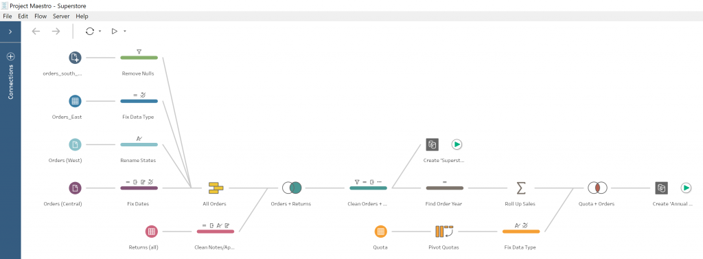
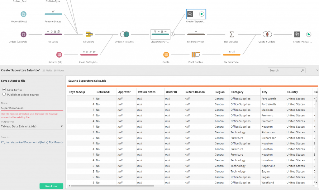
Tableau Prep has a simple and clean user interface that looks and feels like the final form of Tableau Desktop’s data source screen. Here’s a birds-eye view of a Superstore “flow” in Tableau Prep:

Superstore Flow in Tableau Prep

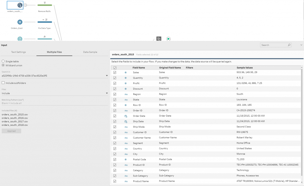
The aesthetic is pleasing and familiar. Clicking on an element brings up a secondary set of profile panes with more information, tailored to the function of the step. Here’s an example of this secondary window when clicking on a data set (input); you get a nice overview of the fields, field types and some sample values for each. I’m a big fan of this layout:

Tableau Prep Secondary Window

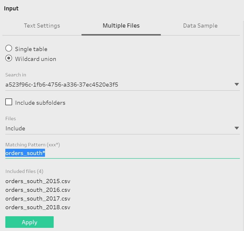
For this input step, we’re combining four years’ worth of orders_south.csv files using a Wildcard union. Using the Matching Pattern, we can limit the files included in this union by filename, which is very useful for filtering out a specific file out of a folder full of generated .csv or .xlsx outputs:

Tableau Prep / Wildcard / Matching Pattern

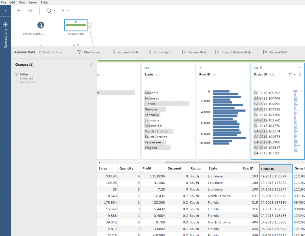
Following the journey of this freshly combined set of order data, the next step in the flow is a cleansing of NULL Order ID values:

Tableau Prep Cleansing NULLs

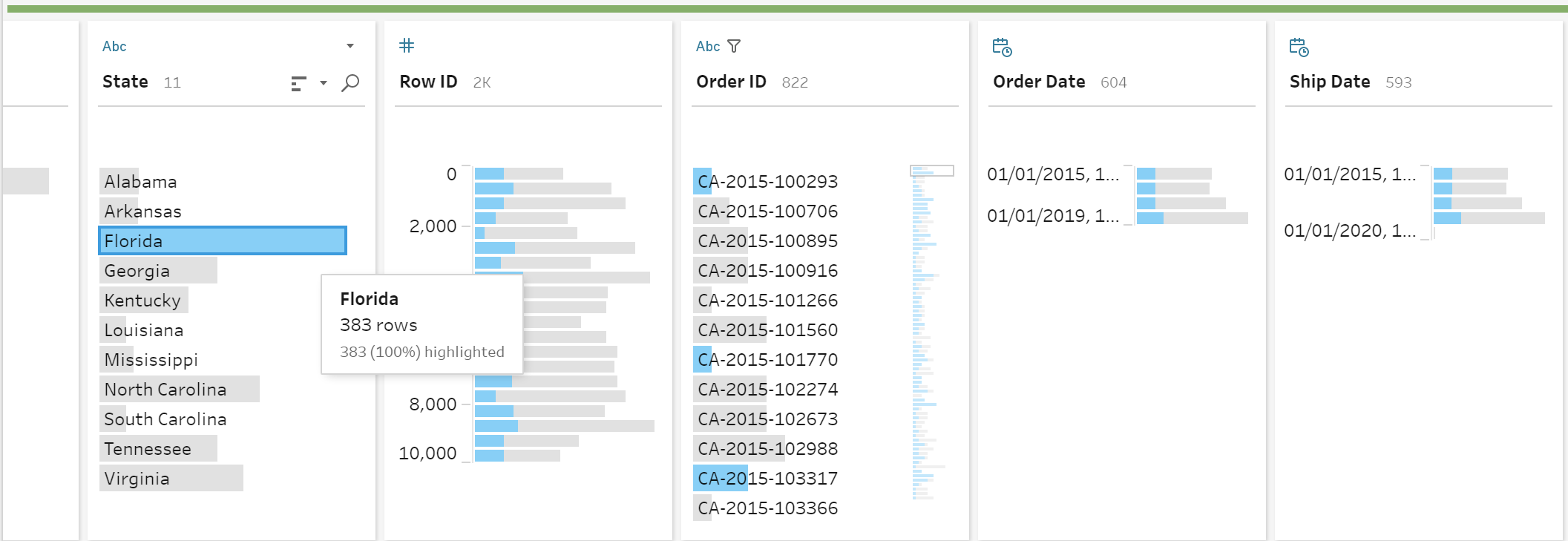
Can we take a minute to appreciate the tiny bar charts and data review elements available in the profile pane? These are some of my favorite features of Tableau Prep because it’s very easy to see distinct values and their respective counts within their respective fields. These features are extremely helpful for spot checking your data. You can even click on a result within a pane and see how that value is associated to the other fields within your connected data set/input. This snazzy visual representation of your data is available throughout Tableau Prep:

Tableau Prep Bar Charts

Data Transformation on the Fly

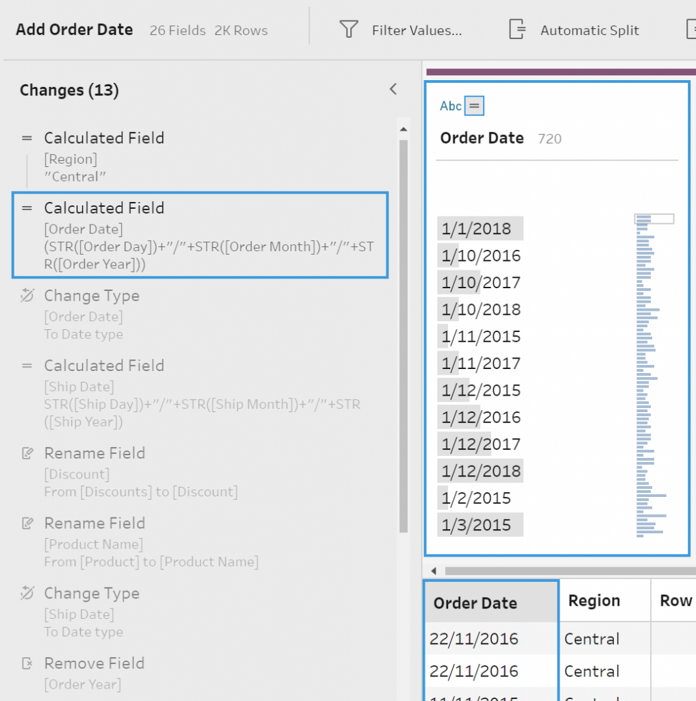
The various transformation steps within Tableau Prep are extensive and helpful; we can change data types on the fly, trim out white space or specific characters from a string, group and replace similar values (e.g. state abbreviations and full state names), pivot data, aggregate data, join or union, and even add calculated fields using the Tableau language we all know and love:

Transforamtion Option in Tableau Prep

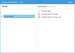
Another of my favorites is the ability for “fuzzy” matching on similar values, based on pronunciation or common characters. This is a game changer. Using the pronunciation-based grouping, Tableau Prep uses a phonetic algorithm to index words by their pronunciation. Here it is in action on an airline field, correctly combining the multiple variations of Southwest Airlines:

Fuzzy Matching in Tableau Prep

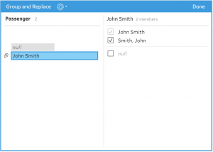
Here, we can see common character grouping successfully combining both version of John’s name:

More Fuzzy Matching in Tableau Prep

Extracting Your Data

Once you’ve got your data and flow in a happy place, the process of generating an extract out of your freshly transformed data is as easy as adding a step and clicking go:

Extracting Data in Tableau Prep

Tableau Prep flows can be output as an extract (.csv, .tde, or .hyper) on your local drives or shared network. They can also pushed up to Tableau Server or Tableau Online.

Connectors

Not every connection available in Desktop has made it to Tableau Prep just yet, but Tableau will constantly develop and add new connections based on demand, like they have with Desktop. Here’s a list of available connecters as of the latest beta version (fun fact: you can connect to Tableau Extracts!):

Tableau Prep Connectors

Being a Maestro beta tester and now using the actual Tableau Prep product, I expected a few issues, but I can happily report I have had none as of this writing. I never had Tableau Prep crash or feel sluggish, and I was delighted with how snappy and responsive the user interface felt. Running the sample flow was fast and results were almost immediate:

Tableau Prep Flow FinishedSome Final Thoughts

While Tableau Prep isn’t quite ready to replace enterprise-level ETL tools, I believe it will become an important part of the Tableau ecosystem. It fits perfectly in the hands of capable Tableau Desktop users. Tableau Prep empowers individual analysts with the ability to transform their data with clicks of a mouse instead of lines of code. While most will appreciate how easily your data can be shaped and cleansed, I would again like to highlight Tableau Prep as a powerful data review tool – the rolling visual representations of your data within the profile pane is extremely useful.

Soon, I’ll have more blog posts highlighting specific functions of Tableau Prep and show you how you can apply them to your data. Have something you want to see specifically, or just want to get more information on Tableau Prep and the Tableau suite of products? Please reach out to us today!

The post Tableau Prep: First Impressions from a Data Engineer appeared first on InterWorks.

Viewing all 2697 articles
Browse latest View live