Question:
“I want to build a Sankey diagram with my survey data, but I don’t know how to even start this. I want to be able to see someone’s response before exposure and after exposure to the test object we are surveying on. Could we hop on a working session and work through this process together?”
If you’ve never heard of a Sankey diagram, they are quite fun. Here’s an interpretation from datavizblog.com:

While there is a more standard use of the Sankey by Assoc. For Institutional Research:

There are several steps to getting this right, and I’ve outlined them step by step below.
Overview
You need two dimensions that you will be connecting between. Next, you need a way to stretch the data between the two axes. In my example, I only have one point for pre-exposure answers and one for post-exposure answers on the survey. This would result in a straight line, not a curve. To get the curve, you need to use the Sigmoid function with your stretch field along with some table calculation magic. Enough overview – let’s just dive into the steps and see how this all comes together.
1. Data Setup
The first step involves structuring the data so that you have a flow between two dimensions. I only have a single record per respondent, and I need two records to connect in a Sankey. Many survey data sources group the data into one row by respondents – that way, when you look at that respondent in a spreadsheet, you can see their change. This doesn’t support a Tableau Sankey well, so we are going to restructure the data using a custom SQL union duplicating the same sheet. We’ll also place an axis side field for the left and right sides of the chart, as shown in this image:

2. Padding
We only have two points of data now, but we need to add some data densification, a.k.a. padding, for all the data we don’t have between these two points. To do these, I start by creating a calculated field called MyPad:

Now that we know which side is the left side, we can stretch to the data to the right using bins. Right-click the MyPad field and create bins of size 1. I named my field ToStretch:

Let’s see this start to come together. Next, we create another calculation entitled T. I also defaulted the table calculation to use ToStretch:

And the last calculations we need before creating the S-curve are the ranking calculations. These will keep our data points correct vertically when we build out the Sankey in a minute:


3. Creating the Curve
The mathematical function to create an S-curve is the Sigmoid:

We can use Tableau to recreate this function to look like this:

We then need to add in our ranking functions to get our curve field correct:

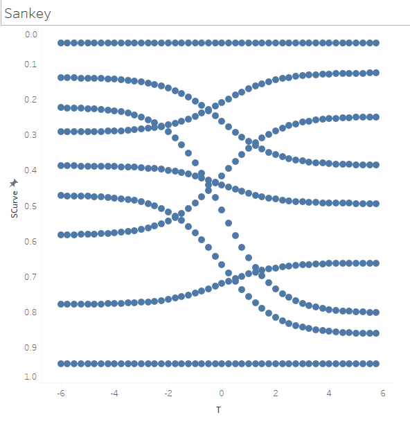
4. Building the Viz
- Pull the two dimensions you are wanting to connect to the Detail shelf along with the ToStretch bin field.
- Change your Mark type to Circle.
- Pull T to Columns and Curve to Rows. You’ll notice the Delta letting you know that we will need to update the table calculation to display the curve correctly.
![T to Columns, Curve to Rows]()
- Right-click on Curve pill and edit the nested calculations like so:
- Rank 1 to be Specific Dimensions from Pre to Post to ToStretch, in that order.
- Rank 2 to be Specific Dimensions from Post to Pre to ToStretch, in that order.
- T to be Specific Dimensions for ToStretch only.

 |
 |
 |
I now have a Sankey chart that I can start to make formatting changes to. Make the Mark type a Line instead of circles, adding sizing to show how many respondents there are for each line. You might also create two additional charts for the left and right so you can see what the respondent answered pre vs. post-exposure.
I hope you find this helpful. If you need help like this, reach out and get InterWorks Assist on your team.
The post Advance with Assist: Creating a Sankey Diagram from Survey Data appeared first on InterWorks.